
Brands today are based on how customers feel about you.
Your brand isn’t what you think it is; it’s what your customers say it is. Their perception comes from the gut feeling they get when encountering your brand.
I’ve learned that people will forget what you said, people will forget what you did, but people will never forget how you made them feel.
Maya Angelou
Due to the cluttered marketplace of our time, the power of a brand has shifted from the company to the consumer. How can you have a successful brand when you can’t control how people feel about you?
To start, you have to ask yourself: if your brand was a person at a happy hour, how would you want her (or him) to be described? Giving your brand a personality will help you to uniquely position yourself and determine how you will communicate with consumers.
Considering that there are so many brands out there, individuals have certain spaces in their mind where their favorite brands are associated with particular products or services. For example, when I say coffee, I think Peet’s. However, to someone else, the answer could be Starbucks, Dunkin Donuts, or even McCafe.
Peet’s occupies my coffee brain space because they are transparent in their messaging, locally sourced, and their packaging proves their authenticity. They have “Freshest By” and “Roasted” columns on the front of their coffee bags so that consumers know when it was made and when to use it by. Little touches like this make a big difference to consumers and help build customer loyalty. I feel that I can trust them; therefore, I am a loyal drinker of Peet’s coffee.
Before you begin playing with pixels to make a logo, your company should at least be able to answer these two questions:
- What is your brand’s purpose?
- What benefits do you have to provide to consumers?
Having those answers clearly defined is a good start to your brand messaging and enough to start thinking about what direction you want to take your brand in. If you’re struggling to answer these questions with certainty and strong brand-to-customer alignment, we do provide a one-day branding workshop to help your company find its purpose and benefit in order to create the gut feeling that will help attract ideal customers.
We’ve already covered the cost of a logo design, so today, we will dive in on defining the seven different types of logos and which one will be best suited for your business.
1. Abstract Mark
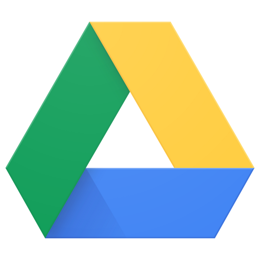
Example: Google Drive
What is it?
An Abstract Mark is a logo that is completely abstract to the naked eye but has a sense of mystery and pulls from a deeper meaning. For instance, did you know that the Nike “swoosh” logo was based on the winged goddess of victory, Nike? It also encourages the feeling of movement, which was very important to Phil Knight. Bet you didn’t get all that from just a glance!
Pros:
- Creates a sense of curiosity — people want to know what it means, which leads to a lasting impression and longer engagement
- Best for global brands — there is no need to translate anything, and they are open to interpretation (which could be a con if it’s too ambiguous)
- Stand Out — they don’t have a common trait so they allow you to create something truly unique
- Good for when you have a generic business name — if the name isn’t memorable, at least the mark can be
- Great for branches of a brand — when you can’t use the parent brand’s logo and you have to create your own identity, marks are a great differentiator
Cons:
- Hardest to gain recognition — this is because the name isn’t associated with your logo (at first—you must gain fame like Nike did)
- Clarity — if the logo is too abstract, it may lose its meaning and brand message
2. Mascot Logo
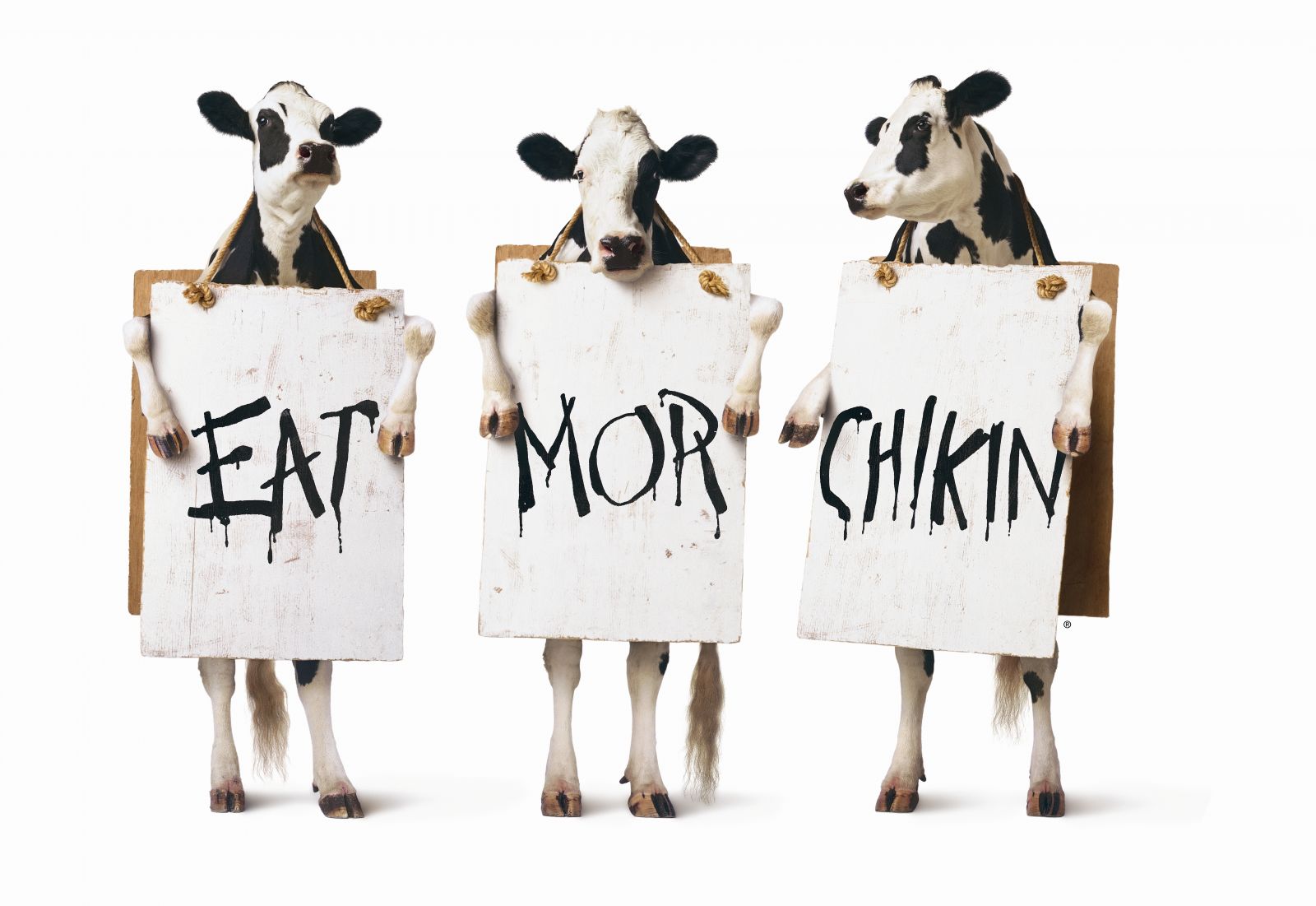
Example: Cow — Chick-Fil-A
What is it?
A mascot is a concrete version of your brand. You are taking your brand and embodying it into
something tangible. Some people use illustrations, costumes, animals, or even real life actors. Much like how the mascot is the key interaction between a basketball team and its fans, the mascot logo gives your audience a familiar character that they associate with your brand.
Pros:
- Best for Families and Sports — they create a wholesome atmosphere and can create a lot of hype; if the brand is for younger audiences, it’s a great way to engage brand-to-kid.
- Great for viral content — they can easily be brought to life and used for video.
- Great for social media interactions — they can interact with consumers, so people can actually talk to your brand without it feeling too stiff or formal.
- Easily recognizable — similar to the abstract logo, mascots are hard to replicate.
Cons:
- Personality — it can take a long time to figure out the personality of your brand, and if a person is managing the mascot’s interactions (like Wendy’s on Twitter), it requires a lot of training as reputation management is placed in the hands of an employee.
- Backlash from the public — if people think your mascot is creepy or offensive, they will not be a fan of your brand (think—Kansas City Chiefs’ old logo).
- Harder to update for a rebrand — once people have become accustomed with your brand mascot, they don’t like change because the mascot loses its familiarity with consumers.
- Not good for print — it’s necessary to have a secondary logo for any 2D representations of your brand, so a 3D mascot would require adapting for print
- Actor risk — if you have a real person representing your brand, what they do in their personal life will affect your brand. Remember Subway Steve? He gave a whole new meaning to footlong...
3. Combination Mark
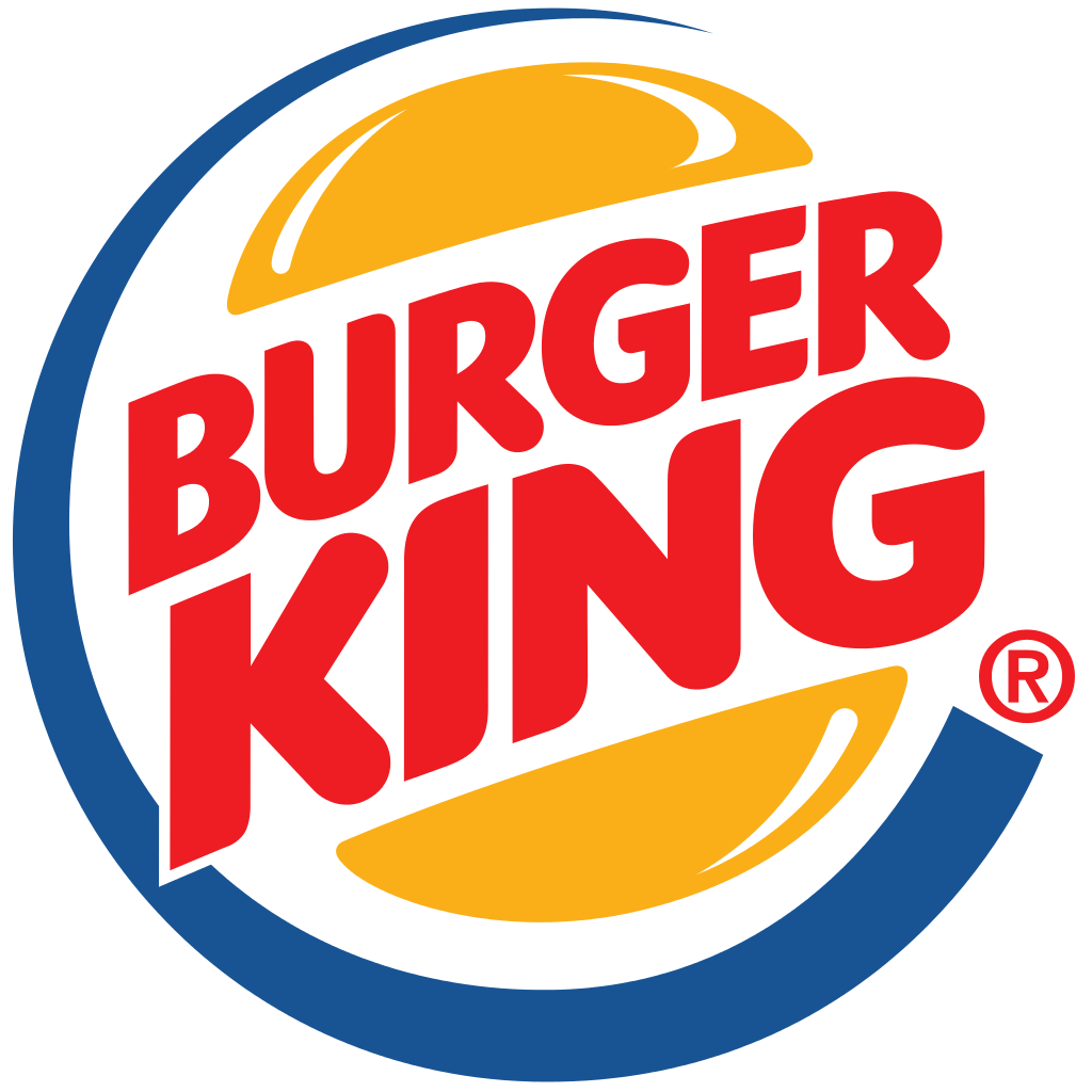
Example: Burger King
What is it?
A combination mark is exactly like it sounds: a combination of using the brand name with a mark. The mark itself can be abstract like Adidas, or a pictorial mark like Taco Bell.
Pros:
- Easy to trademark — because you have the name and a mark, it’s easier to gain the rights to this type of logo. Even if another brand has a similar icon, the likelihood of having a similar name is slim, and vice versa.
- Great for brand recognition — the name is a part of the logo, so it’s easier to associate with a brand, especially since it’s easy to read and recognize.
- Great for all businesses — this type of logo can be used for all sorts of industries and can be designed to cater to specific audiences.
Cons:
- Limiting — usually, a combination mark only has one orientation, so it’s hard to use across multiple platforms and normally only looks good one way.
- Responsiveness* — it’s hard to make this logo smaller because then the words can become hard to read.
*Note: this type of logo can be responsive if it’s clearly outlined in your brand guide (like Slack). However, in most cases, the combination logo is supposed to be used as one piece and not separated.
4. Emblem Logo
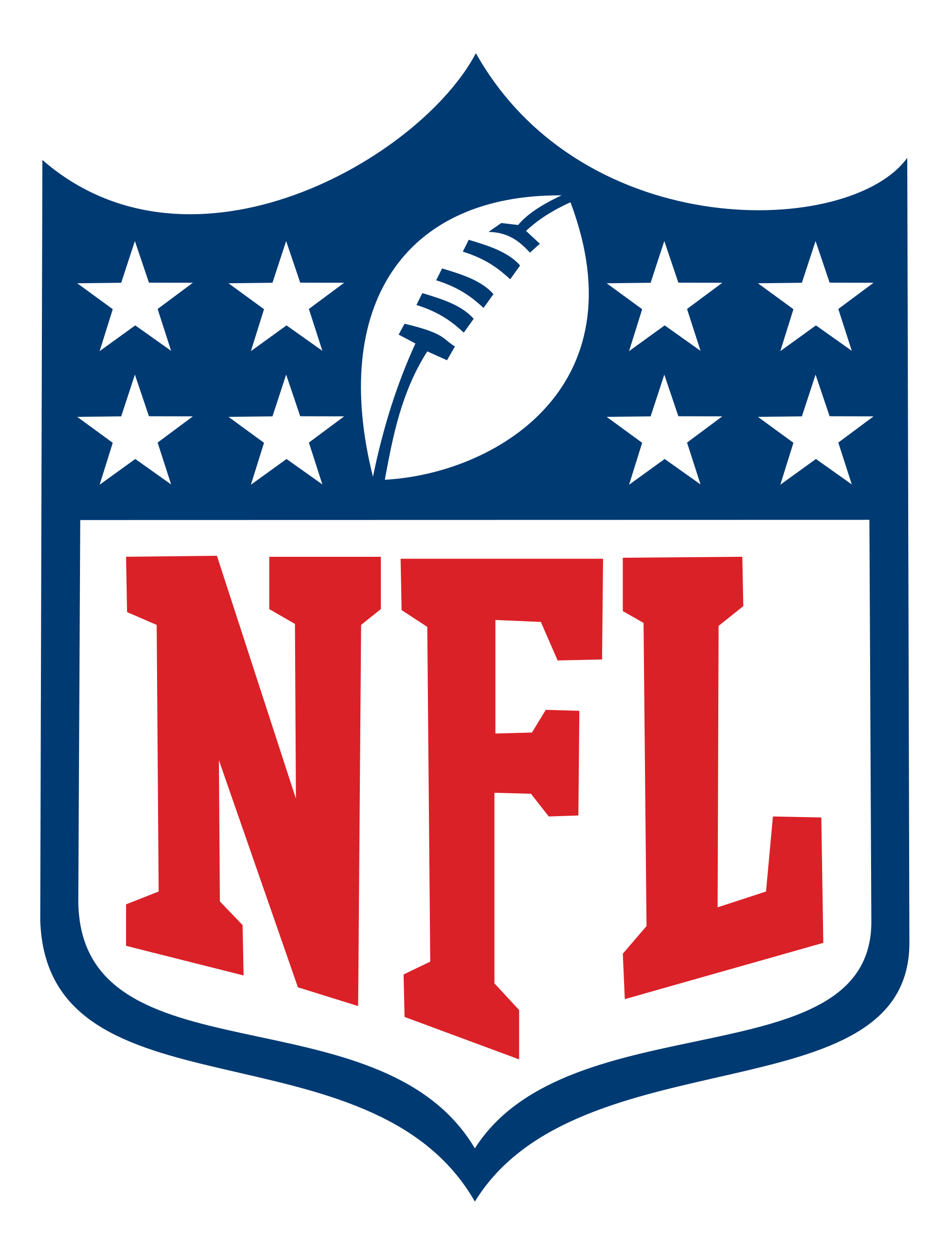
Example: NFL
What is it?
An emblem is the original form of a logo. Emblems have been around for many years—which is why many have a traditional and almost royal crest-like style to them—and are created to represent an entire body of people and single person alike.
Pros:
- Best for colleges and sports — emblems are easily scalable for merchandise and help create a sense of belonging to a group, especially when used with brands that are community-focused in some way or another.
- Broad meaning — an emblem doesn’t have to look like any particular product or service, so it can grow with your company.
- Great for umbrella companies — because emblems are more broad, you can easily use them for parent companies.
Cons:
- Responsiveness — emblems tend to only look good at certain sizes; if you go too small, it’s hard to see the details.
5. Lettermark Logo
![]()
Example: IBM
What is it?
Which is easier to remember: National Aeronautics and Space Administration or NASA? The answer is obviously NASA, which is why the brand decided upon a lettermark logo. The job for this type of logo is to take a brand with a really long name and give it a catchy acronym, simple as that.
Pros:
- Adaptable — lettermarks are easy to scale and can be used across multiple platforms.
- Memorable — they were made to be memorable and catchy, and it works—no one really knows what IBM stands for, but it’s easy to picture the famous logo in your head, right?
- Work best with existing brands — if you’ve already established your brand, creating a lettermark will make it even easier for consumers to know who you are.
Cons:
- Details are important — all logos should be done professionally, but when you only have letters to represent your company, the little details matter a lot more. If one thing is off, it will be really noticeable.
6. Pictorial Mark
![]()
Example: Apple
What is it?
Pictorial marks are a recognizable image that is simplified to complement your brand. Pictorial marks can be very literal (like Google Maps), a play on words (like Twitter), or dive a little deeper into your brand purpose, (like Snapchat—a platform where your photos disappear like ghosts).
Pros:
- Good for global brands — pictures are universal, so having a pictorial mark is great for closing the language gap between different cultures.
- Best used for established brands — it’s hard for consumers to associate a picture with a brand unless they already know what that brand is. For example, Target had to use a combination logo for a while until the target was strong enough to stand on its own.
- Connect Emotion — take Walmart for example: they used the smiley face to represent low prices and the feeling of happiness you get from them.
Cons:
- Restrictive — if you start off selling coffee and then later decided that you also want to sell sandwiches and smoothies, it’s hard to imply what your brand is capable of if you’re using a coffee mug as your logo.
- Deciding what aspect to represent — do you want to be literal, have a play on words so it’s easy to remember, or focus on your brand’s uniqueness? Getting too abstract is a concern, too, as you want your customers to easily understand what the logo is supposed to represent about your brand.
7. Wordmark
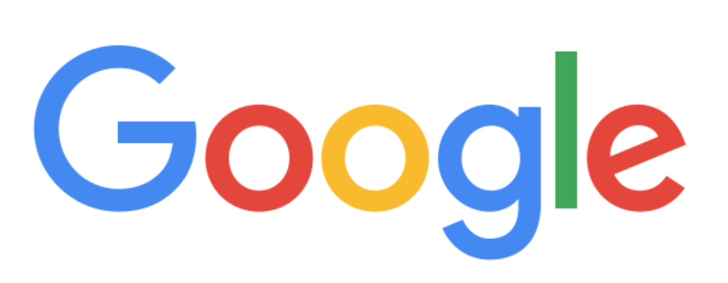
Example: Google
What is it?
Simply put, it’s your brand’s name written out—and sometimes will include a descriptive word that says what your company does. For example: Costco wholesale. When choosing this kind of logo, it’s key to find the right font choice and pay attention to the details. Speaking of details, did you know there is a hidden arrow inside the FedEx logo?
Pros:
- Adaptable — wordmarks are easily scalable and can be used across multiple platforms.
- Great for starter companies — your brand name is present so it gains immediate recognition, even for smaller or newer brands.
- Memorable — as long as your name isn’t too long, using a wordmark logo is a great way to make your brand memorable because that’s the only thing the consumer has to remember you by. Your brand name is more likely to stick because it’s in the logo itself, likely improving the chances of brand recall when they’re shopping around.
Cons:
- Focus on name — this can be a bad thing if your company name is too long—in which case, it would be better to use a lettermark logo.
- Clarity — it can be hard to tell what your company does based on the name alone, especially if the brand name doesn’t help to explain the types of products or services offered, like Visa or even Google.
Conclusion:
Picking out the type of logo you want for your company is a hard choice, but I hope that this guide makes it a little easier for you.
Remember to ask yourself these questions in order to establish a few things before creating a logo for your company:
- If your brand was a person, how would they be described?
- What is your brand’s purpose?
- What benefits do you have to provide to consumers?
- What goals does your company have?
However, the most important question to ask yourself is:
What feeling do you want associated with your brand?
Need help getting those questions answered? We’re here for you.