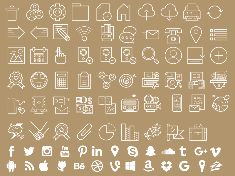
Download to the icon set here!
We live in a very fast-paced society.
It seems as if we are always in such a hurry, constantly running around to work, school, appointments, social engagements...do we even know what “slow” means anymore?
Or “down time,” for that matter?
With the advances in technology, we are constantly able to be updated, talk to one another, look up random facts to prove a point...and to us, 30 seconds feels like an eternity.
There is so little time to spare these days to just sit down, read, and absorb information. I think that’s why visuals are becoming more and more popular, and icons ever more important.
So, how can icons improve marketing?
Well, did you know that your brain can process and image in 13 milliseconds? Talk about fast!
Icons are the fastest way to reach out to a user because of how quickly our brain recognizes images. All day long, your brain is constantly trying to figure out what it is seeing and then processes that information.
So, icons fit right in!
I think this is part of the reason why icons are so popular. Well-executed icons have the ability to convey a message quickly and efficiently.
For example, think about the apps on your phone. Your calendar app, settings, call, etc.—these are all icons that have been associated with actions in our brain. You don’t have to read “calendar” to know that you are opening the calendar app.
These associations carry over to all icons.
We still use the floppy disk as a "save" icon because back when it originally came out, that was the easiest way to save and transport information. Young adults today don’t even know what floppy disks are! (And yet...they know exactly which icon stands for "save.")
That is the power of a well-executed icon; it can withstand the test of time because it has been strongly associated with a necessary action.
The way icons are being designed is changing, too.
When icons first came out, they were pixelated and black. Now, we have found a way to make icons more visually appealing and unique.
The way icons are constructed can be manipulated to suit a brand.
For example, Google Materials has icons that are colorful—with a little bit of depth—usually on a block of color, whereas Apple has black vector icons with transparent backgrounds.
Even though icons are great, they don’t have much use unless they are paired with actions that make sense. I wouldn’t expect a calculator icon to open my email.
That being said, it’s very important to find an icon set that speaks to your business and style.
When looking into downloading or making icons, you want to make sure the set contains key actions for your company.
If you are a bank, you wouldn’t want to download an icon set for a coffee shop, so make sure that the set contains items that are specifically useful to you and your business.
You can DOWNLOAD OUR FREE MARKETING ICONS SET
It contains 85 icons that are specific to marketing.
This set contains “Targeting,” “Strategy,” “Conversion,” and more!
It has social media icons too!
It’s also important to make sure that you are using the icons properly—just because it’s an icon doesn’t mean that it has to be tiny.
Icons are both useful and visually appealing; they can be used as a decoration as well as an action.
![]()
Bottom line? Free icons are awesome!


