
Have you ever tried to explain to someone how to use an app or a website?
Kudos to you and your patience if the answer to that question was yes (as long as you kept your cool—if not, that’s not cool).
In that moment, you may have been unaware that you were breaking down that app or website’s usability, user experience, and user interface into easier-to-digest language.
Here’s how they’re formally defined:
-
User Experience (UX) is how you feel when interacting with a computer-based program; this includes video games, websites, and apps.
-
User Interface (UI) is how you interact with a program. It’s more about the placement of buttons and why they are placed there, including things as simple as the signup button.
-
Usability is how well UX and UI work together.
Why should our approach to designing websites be any different than how we tackle other design tasks?
There are a few people who think that the only job a designer has is to “make things pretty” (*COUGH* bad designers & people who have no idea what designers do *COUGH*).
When it comes to websites, you’re really designing an experience—after all, the site isn’t for you; it’s for your audience.
Do you know what the 3 most important words in design are?
(Don’t look below—take a guess first…)

Empathy, empathy, empathy.
We must be empathetic not only to our client but to our users as well.
We have to create a digital space that is easy to navigate, intuitive, purposeful AND ridiculously good looking.
We cultivate our empathy by conducting customer research, client meetings, and usability testing.
To help find the perfect harmony between usability and beautiful design, there are 5 areas that need to be addressed:
Home Button
Having a home button is essential.
I’ve been reading a great book called Don’t Make Me Think by Steve Krug where he mentions that we are creating a digital space, and it’s important to have a “restart” button in case people get lost while navigating your site. (Hey, it happens to the best of us.)
Even if you hide every single menu item, it’s always a good idea to display the homepage. That way, the user has a chance to get back to known territory and not get lost in the digital abyss.
A general rule of thumb is to keep the home button on the top left or center of a page—these are the two most common placements so that users know to look there when they need some help.
Call-to-Action (CTA)

There are plenty of reasons why someone can come to your site, but if you don’t lay a clear path out for first-time users, their experience may feel a lot like being lost in the woods without a compass.
Do you think that every lost person could tell you which way is North? (Not this guy!)
CTAs are there to gently push the user to your desired—and very clear—outcome.
If your focus is ecommerce, you can display your products with bright backgrounds, motion graphics, and all the bells and whistles...but if the user doesn’t know that they can buy the products flashing through the screen, then your website is useless.
CTAs should be sprinkled throughout your site to cause an action. It’s best to have an obvious placement, size, and color to keep them consistent; that way, it’s intuitive for the user to click on them.
And while you may think, “at least it’s pretty, right?”
The answer is…no, you can’t pay the bills with pretty points.
It’s also best to have your CTAs stand out; otherwise, they just clutter the page and cause further confusion.
Scroll

Users generally only have 2 ways to navigate a site: they can scroll or click.
Some sites have fun making users scroll left and right instead of up and down, but this slows down the user because they aren’t used to navigating in those directions on-screen.
If you do want to play with your scroll orientation, make sure that it has an obvious purpose.
People are used to navigating the web in a certain way, so changing something as simple as the scroll can be very jolting for a user.
Animation

Motion graphics were booming in 2017. Every single pixel that could move was indeed moving in cyberspace.
However, using too much animation can be disruptive. Just like the CTAs on your website, animations should have a specific purpose.
Humans are designed to notice what’s different.
On a still page, animations are lively and attention-grabbing, but you want to make sure that they are helping to guide the user to your end goal and not just become a distraction on the screen.
Animations are great if you are trying to showcase specific features of a product or service, but make sure you have a purpose for animating elements of your website and don’t just add them for “effect.”
Readability
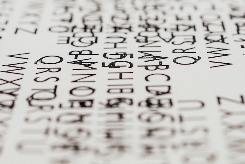
2017 was also the year of the typography revival.
Designers enjoy breaking apart text and creating “cool” headlines, but if the user can’t read your website, then the type becomes more of an aesthetic for designers and nuisance for users than a neat effect.
If you are counting on users to be able to read your headlines (which you certainly should), make sure that they can be read easily.
Most users don’t read every line of text on your website anyway; instead, they skim the material until they see something that sounds like what they were looking for.
If a user can’t even skim your website, they probably won’t stay for very long.
Final Thoughts

With 2022 around the corner, everyone is looking for the next design trend.
However, it’s important to keep in mind who you are designing for and how to keep them focused—only then can you look at how to make it pretty.
So remember:
- The home button is essential, and the placement is best in the top left or center.
- Calls-to-action are mini guides for your users. They need to be consistent to explain what to do and where to go.
- Keeping the scroll standard, while boring for designers, helps to keep users from getting disoriented.
- Animations should be purposeful, not distracting.
- Readability should always be your main focus in order to help users get familiarized with your site.
Keeping in mind these 5 basic principles of usability will help you crush your projects for 2022.