
In a perfect world, a marketer’s job would be to introduce people to a brand and magically turn them into customers as a result—no extra content, no offers, no nothin’.
In the real world, it’s not that linear: the customer journey requires attention, strategy, planning, and being at the right place at the right time.
One way that marketers achieve the latter is by tactically placing pop-ups on websites to entice the visitor to get more involved, committed, and, ideally, loyal to the brand.
These pop-ups are an easy and highly effective opportunity for placing a call-to-action (CTA) to get a user to do whatever the pop-up offers.
You can learn about what a call-to-action is and how to plan, test, and optimize your own in a previous article, but the basic concept you need to know is that:
A call-to-action is a method in which select words are used to prompt a user to complete an immediate action in a sales setting, either online or in print form.
Now, there are infinite ways in which you can prompt people to perform an action, but a lot of those ways are just not effective. If you make the user confused, irritated, bitter, or any sort of negative emotion, you’ll be lucky if they stay on your site at all after that moment.
Guilt-tripping CTAs used to be funny when they first became trendy, but that luster of good fun and clever humor has long since worn off. Now, people prefer honesty, clarity, and professionalism when encountering a brand’s offers, not feelings of guilt and sass.
Today’s lesson in crafting CTAs is a bit unorthodox—I’m going to take you on a journey of the worst CTAs I’ve encountered so that we can learn what not to do when crafting your own. I’ll throw in some great examples, too, so that we can contrast the approaches and get inspired for crafting our own CTAs.
Of course, this analysis is subjective and the reaction can vary per person, but if a majority of your ideal customers are turned off by a guilt-tripping CTA, chances are that you should retire that strategy immediately.
The first form of guilt-trip: the “no thanks, I want to fail”
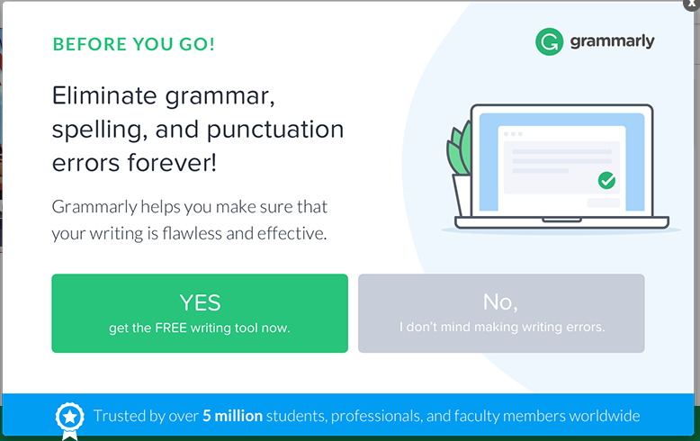
Now, I have to admit that I have a personal vendetta against Grammarly’s choice of words because I am the “grammar police” at Ascend. The very thought that I’ll be making grammatical mistakes without their product comes off as presumptuous and, well, rude. How dare Grammarly assume that I haven’t made it this far without leaning heavily on spell-check?
If there are other viewers of this pop-up who are as passionate as I am about grammar, they’re likely to become irritated—and perhaps slightly offended—by Grammarly’s guilt-tripping approach to making users say “no.”
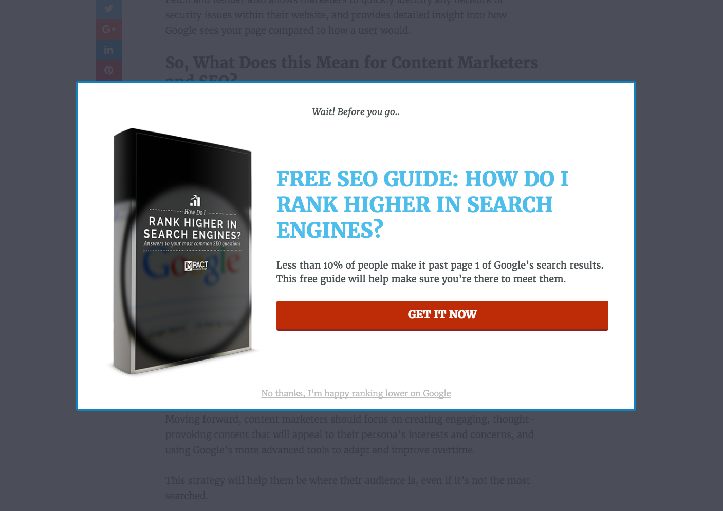
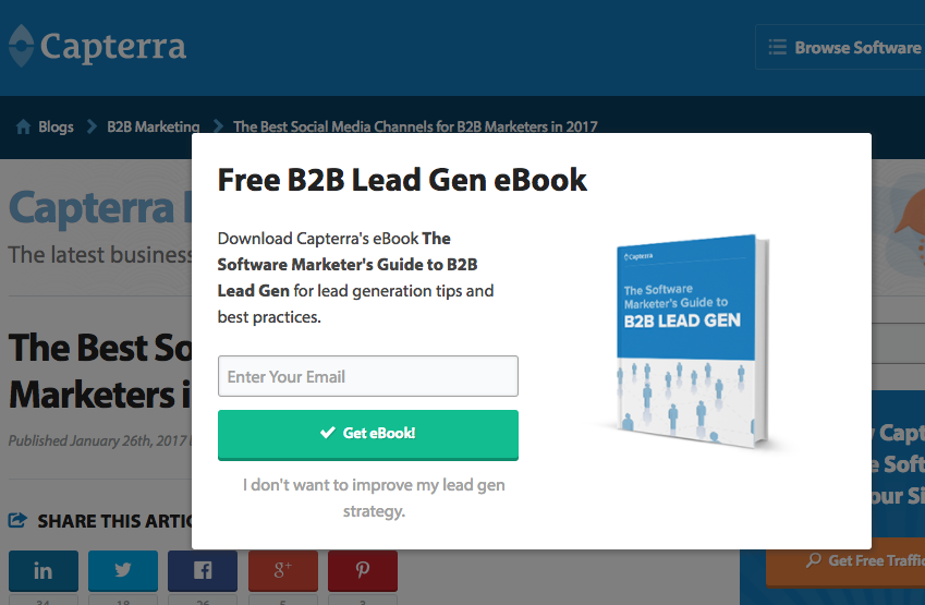
This brand made the exit button on their pop-up more of a breakup than a casual departure: not only is there no “x” button to close out of the window, forcing you to click their guilt-inducing message, but they use “I’m happy ranking lower” as a last-ditch effort to get users to second-guess themselves and download the guide after all. Of course, if someone is irked by the thought that this company assumes that their brand will rank lower without a single guide, that user is unlikely to want to download it anyway.
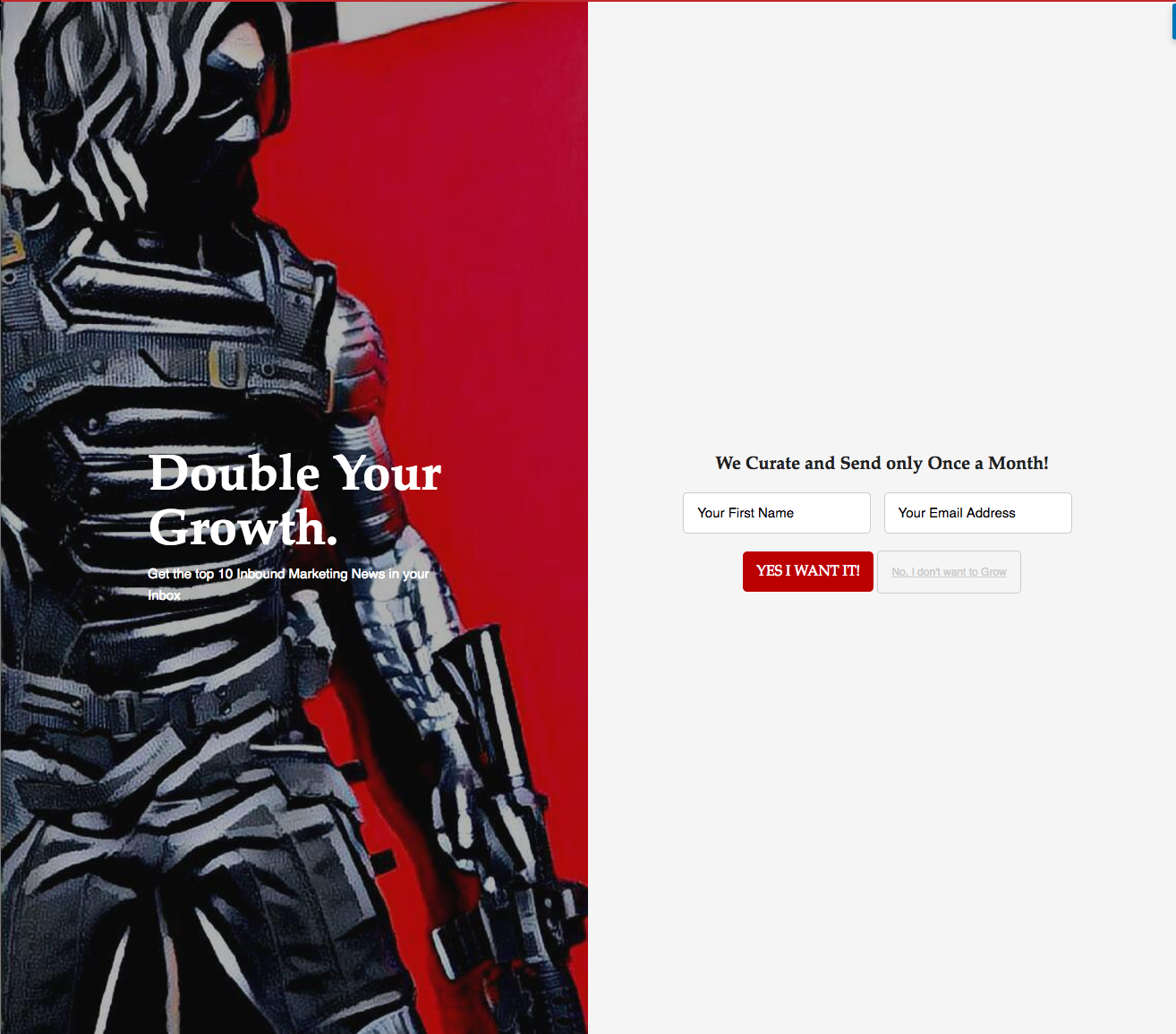
While “double your growth” is great copy for grabbing a marketer by her priorities, it doesn’t work quite so well when twisted the other way. No business person ever said “I don’t want to grow,” and while it may seem like not being contradictory is reason enough to subscribe, it can backfire instead. A viewer may see this guilt-trip as a challenge and go find other ways to grow his brand than through this newsletter.
.png)
This may be my favorite of this category—who doesn’t like tasty food? Perhaps fire-breathers, because their taste buds are toast (pun intended), but that’s quite uncommon.
The first problem: “tasty” is highly subjective, and so someone viewing this ad may not actually like the kind of food that is featured in this recipe guide anyway, which sort of proves the brand right in a cruel way. It’s like saying to that potential subscriber, “you have bad taste in food and therefore don’t want our newsletter.” Rude? I think so.
The second problem: their primary CTA is simply “submit”—perhaps the most vanilla way (another food pun, anyone?) to entice someone to sign up in the history of CTAs. If this brand wanted their readers to feel like they’re truly getting something exciting and valuable for signing up, the copy could have piqued their interest more. How about…”unlock our most delectable recipes now” or anything better than “submit?”
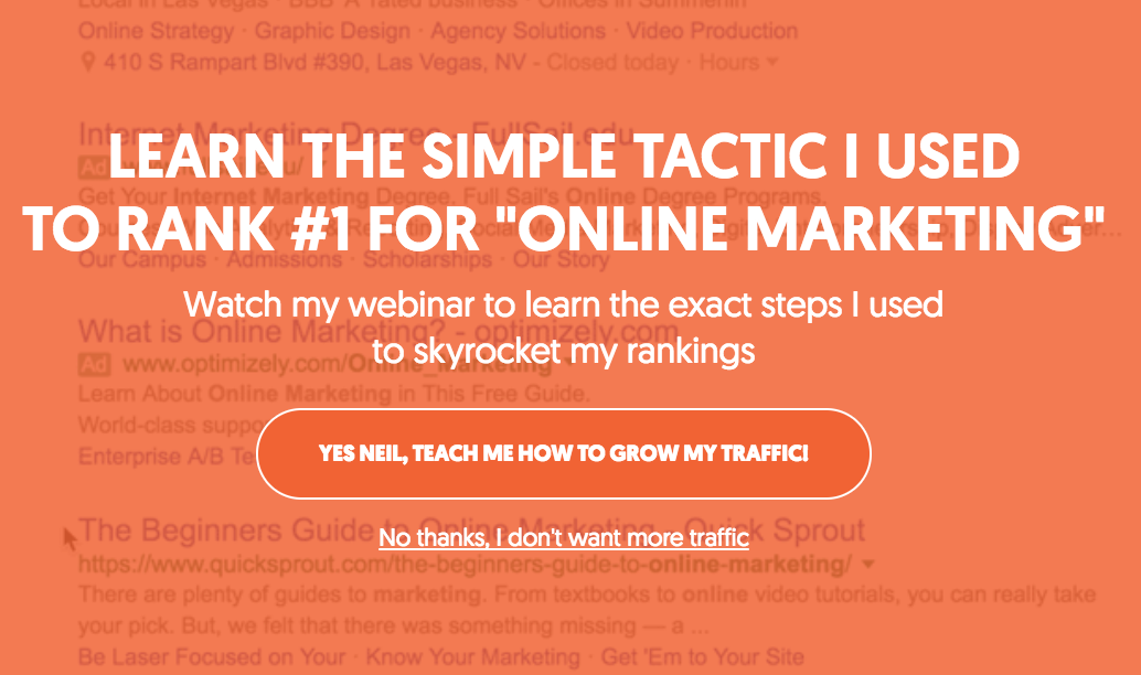
Who doesn’t want more traffic to their site? The answer is no one; I can’t even think of an obscure exception for this time. On top of that, no one wants to be told that they have to watch a certain webinar to get more web traffic; it just seems pretentious on the brand’s end to dangle such an immense promise over the reader’s conscience over one offer.

Two different brands (at least) used the same guilt-trip of losing lead opportunities as the alternative to clicking through to their offers. Worse yet, neither of these pop-ups do a good enough job at relaying exactly how clicking the CTA will specifically help them get more leads, so the offer is instantaneously weakened by this initial lack of appeal.
Remember: it’s better to focus your energy on crafting compelling copy and an enticing CTA that relays the offer’s value than to put all your eggs in the basket labeled, “what if they say no?”
2. The second form of guilt-trip: “I don’t care”
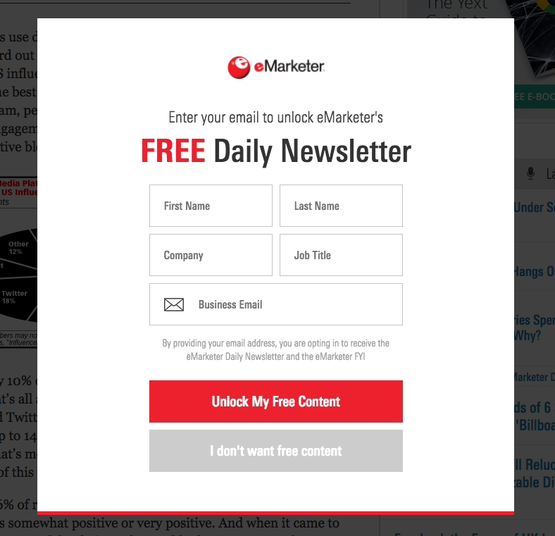
This brand treaded in a grey area—CTA purgatory, if you will—with their copy by omitting any sort of adjectives from their CTAs. Sure, I like free content, but only high quality free content—and guilt-tripping me in such an unenthusiastic way leads me to believe that the following content won’t be super exciting, either. A simple “no thanks” would have sufficed, but instead, this brand’s CTA puts all of the value of the offer on the fact that it is indeed “free,” but not necessarily great.
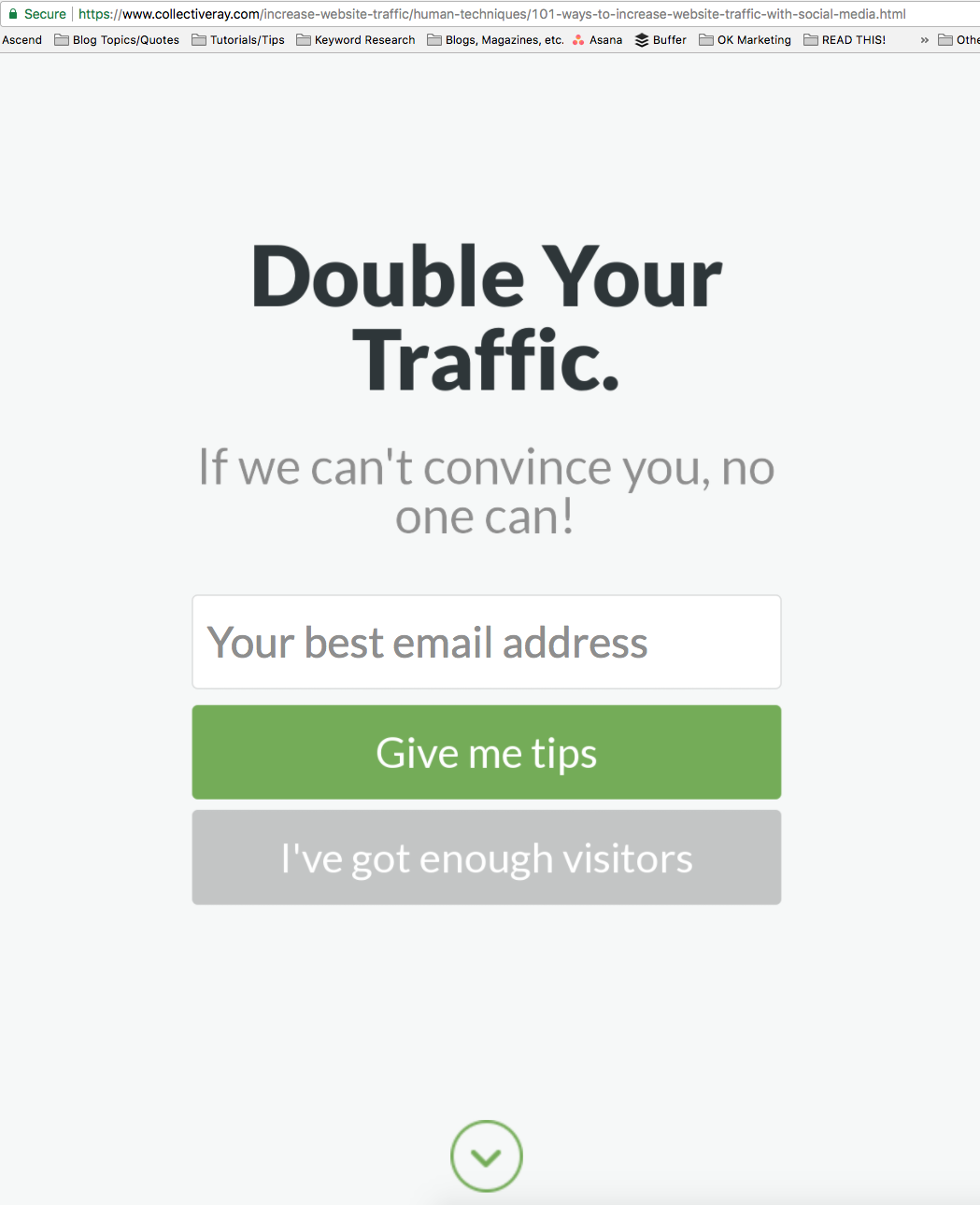
This is an interesting one—the brand outright says that the viewer is stubborn enough that, if he declines this offer, no one can help him at that point. Wow, talk about ultimatums…
And while the guilt-trip is strong with the phrase “I’ve got enough visitors,” the viewer of the pop-up could move their mouse down a few pixels and click the arrow to exit and avoid clicking either button, so that strategy goes out the window.

If you haven’t caught on yet, guilting people by making them click “I don’t care about whatever I’m supposed to—nay, paid—to care about” is annoying. Of course a business owner or salesperson cares about sales, but that doesn’t mean that they care about this brand’s newsletter specifically. They could just as easily care about sales by subscribing to a different newsletter on the same topic; no need to make them feel like they’re doing their job poorly by ignoring your CTA.

This CTA is unique in two ways: their “no” button plainly makes the user admit that they don’t care about the offer, and the “yes” button is placed after the other one. I feel like this brand is showing me right away what my attitude is as a result of which button I press, which may actually work to their disadvantage: if I truly don’t care about this pop-up, I may be more enticed to press “don’t care,” the first button available, to notify the brand that their offer isn’t interesting enough for my liking.
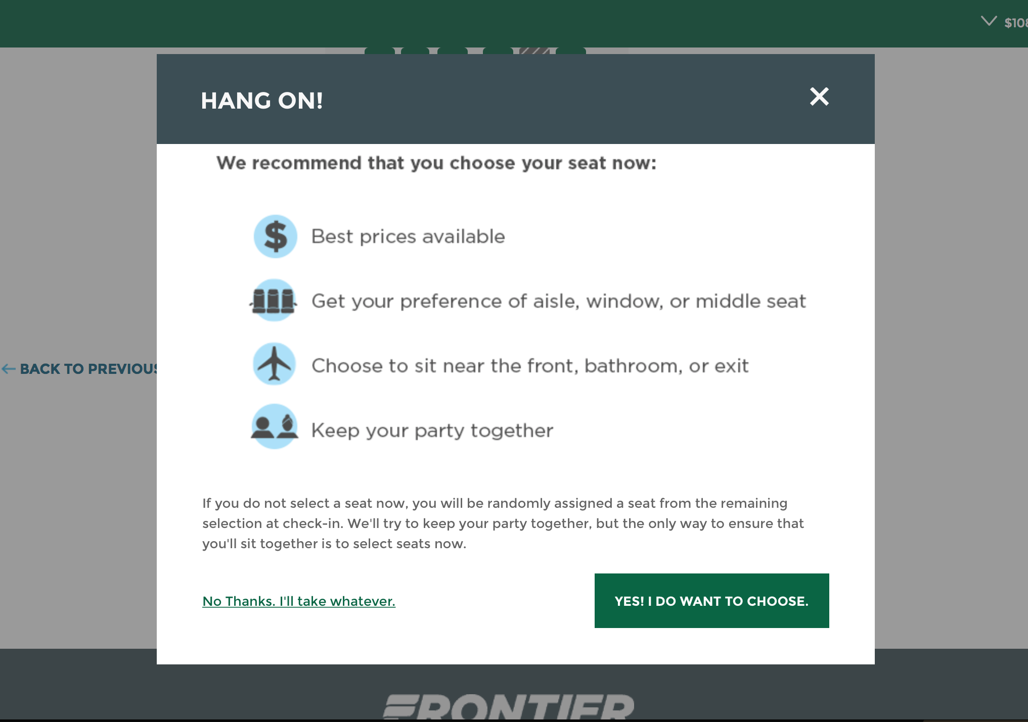
Now that so many airlines make you choose between picking your own seat or playing seat roulette, they’ve upped the ante when it comes to the CTA to get you to pay more. “I’ll take whatever” sounds so indifferent and even passive-aggressive that you can almost feel the airline’s disappointment that you’re not giving them more of your hard-earned money for a designated seat.
3. The third form of guilt-trip: “you have to press yes or no to get out of this one”
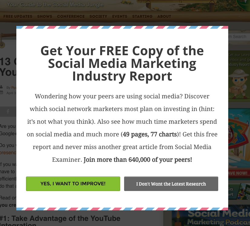
This brand does a great job of explaining the value of the offer with social proof, numbers, and a quick summary, and yet…
You must press “I don’t want the latest research” to get the heck out of there. While the copy itself isn’t the most guilt-inducing on this list by any means, it’s still less comfortable to press “no” than to quietly and peacefully leave the offer by clicking the “x” or the page behind it to make it stop pestering you. When you encounter a CTA like this that lacks an easy escape, it can cause readers to feel trapped and forced to pick a side.
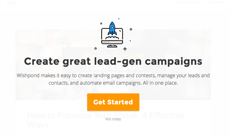
I do personally admire how this offer’s CTA has a simple “not today” underneath it, but again, having to click one of two choices to get out of a pickle is not preferable. Worse yet, the emphasis on that very day that you choose not to take the offer may hint that the offer will come back to haunt you because you intentionally clicked it. Not good for encouraging future visits, to say the least.
4. The fourth form of guilt-trip: “you’ll second-guess your answer to this one”

Because the main CTA here is about posting “smart” content, clicking “no” automatically implies that the viewer isn’t being smart about her content. Even if that’s entirely untrue, no one wants to be told—even indirectly—that their content is dumb, especially if this offer is rejected.
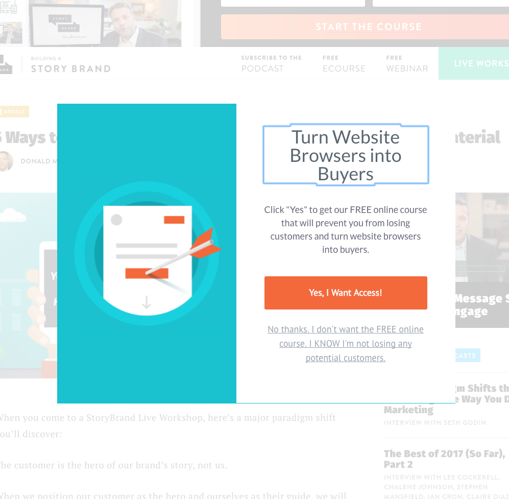
The length of the opt-out is a dead giveaway for how passive-aggressive this brand is about you turning down their offer. I love the part where it says, “I KNOW” what I’m doing...I can’t help but read the copy with extra attitude in my tone because of how it’s structured. It’s hard to take an offer seriously when the opt-out copy is so long and, well, sassy. A simple “no thanks” would have sufficed.
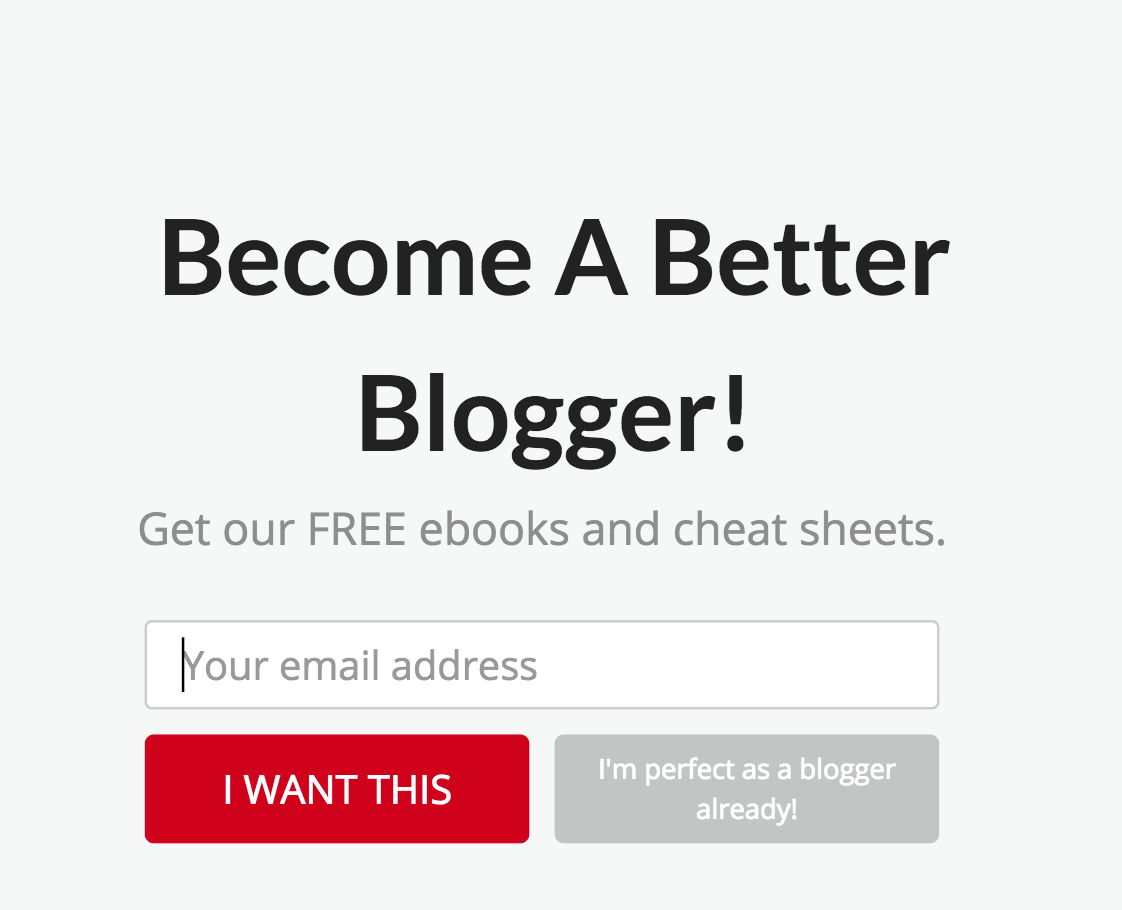
Nobody is perfect, period. You can be perfectly imperfect, sure, but any copy that reads “I’m perfect” at anything is an outright lie—everyone is constantly learning and improving at their job, bloggers included. While I do commend this brand’s attention-grabbing CTA, from the color, down to the word choice, the “no” poses an awkward question for bloggers and forces them to evaluate their competence. That, or it could balloon the ego of a blogger that already sees himself as damn near perfect. Either way, it’s arrogant to call yourself “perfect,” so this brand is leaning heavily on that notion to entice people to click the CTA.

On the one hand, I appreciate that this brand stuck to the classic, safe, neutral “no thanks” for their button on this one. On the other hand, it’s much less innocent beyond the surface: notice that the CTA says, “improve my blog,” which means that clicking “no” actually forces the user to admit that she doesn’t want to improve something, and no one wants to be portrayed as someone who doesn’t care enough.
5. The fifth form of guilt-trip: “don’t you hate these”
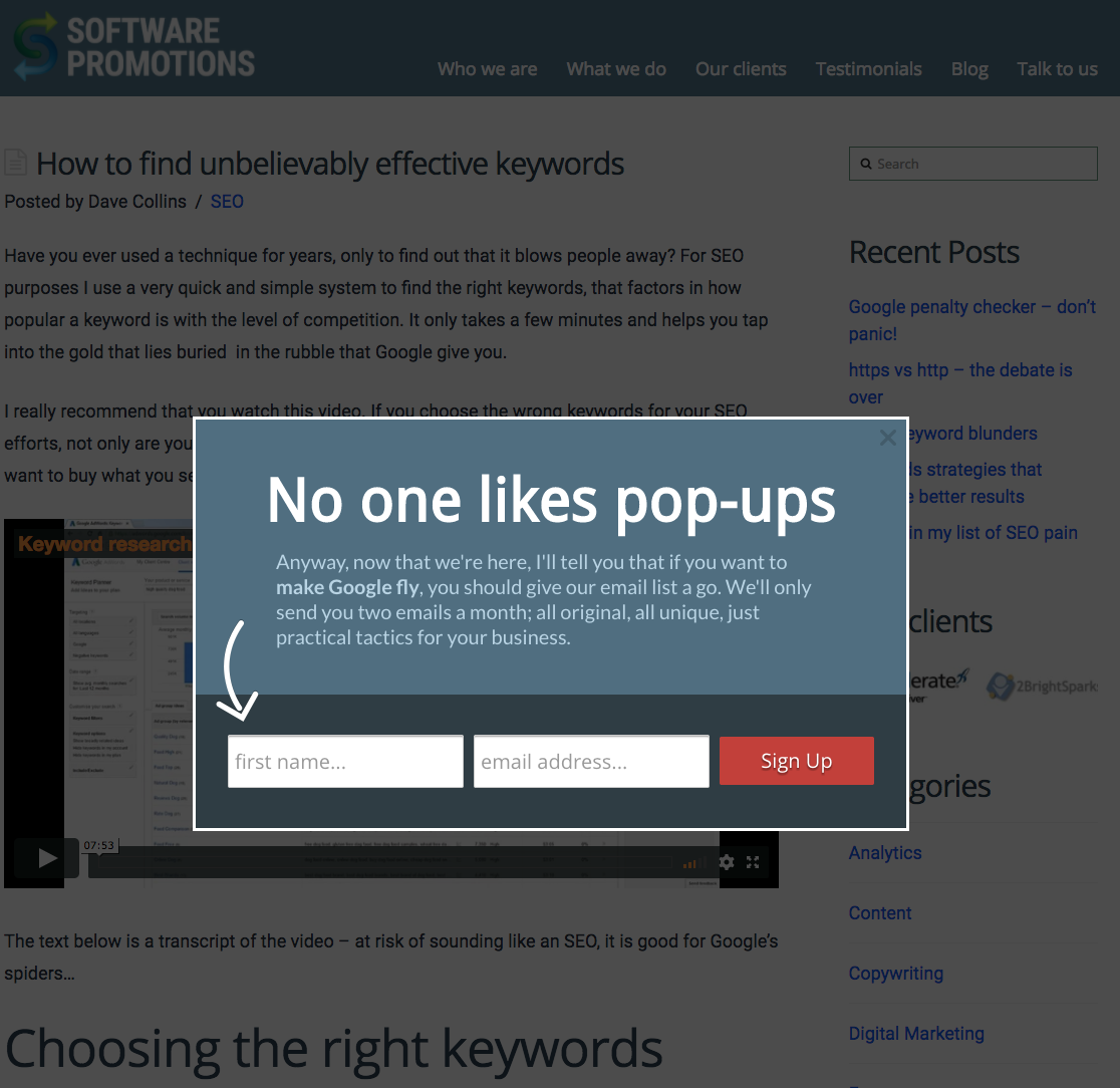
Let’s take a step back and just marvel at how blatantly hypocritical this pop-up is.
The brand has the nerve to use the copy “no one likes pop-ups” in a pop-up! And, as if the strangeness of the situation can be easily brushed off, the next part of the offer almost implies, “funny how we got here, eh? Time to sell to you!”
I highly doubt that directly contradicting the format that the offer is delivered in is an effective marketing strategy. In short, I’m just baffled at this brand’s choice of making fun of itself as if to relate to the user and then immediately annoy him.
There is hope yet. Here are some of my favorite CTAs that are well-written, well-executed, and surely convert like crazy—or at the very least, better than the list above.
I love how this brand gets really specific with the kind of content they’ll be sending you by having you select your preference. Not only does the reader get a preview of the type of content, but she is empowered with catering this brand’s content to her specific needs instead of being lumped into one huge, diluted newsletter.
This CTA is great because it’s a one-click step to getting the offer; they’ve even found your account already and everything. Though there isn’t a clear “no” button, it eliminates space for getting “guilt-trippy” or otherwise irritate uninterested readers.
.png)
This offer is hyper-specific to HubSpot users, which would normally disqualify it from this kind of list, but…
The offer is a discount for existing customers, and the copy below the CTA redirects viewers to shop around on the brand’s services instead of exiting out without another thought. It’s salesy, yes, but clever and engaging by providing an alternative besides just leaving.
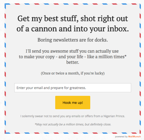
This one is probably my favorite CTA example: this guy has great voice throughout his site, and his humor is engaging because the sarcasm lightens the mood and distracts from the very salesy nature of a pop-up offer. I actually read this whole pop-up by choice, not just because I was collecting examples for this article, which shows how well-written it is. While the only CTA is a very casual “hook me up,” this guy avoids the guilt by not providing a “no” button altogether.
If you want to see more examples of great CTAs, the fun doesn’t have to stop here.
If you have preferences on what you do and don’t like to see in pop-up offers or CTAs in general, I’d love to hear your thoughts below!
And remember: as marketers, we want to optimally write copy that empowers our potential customers to better their skills, knowledge, or anything else through our offers while also avoiding the bitterness that results in guilt-tripping someone when they decline.
Keep your CTAs polite, enticing, and offer-focused for best results and, when in doubt, test the copy on yourself or your peers to get a sense of how others would react to your choice of words.
Our vocabulary can be a powerful tool if used well, and that’s what content marketing is all about.