
Forget everything that you know about color theory.
(Well...most of it)
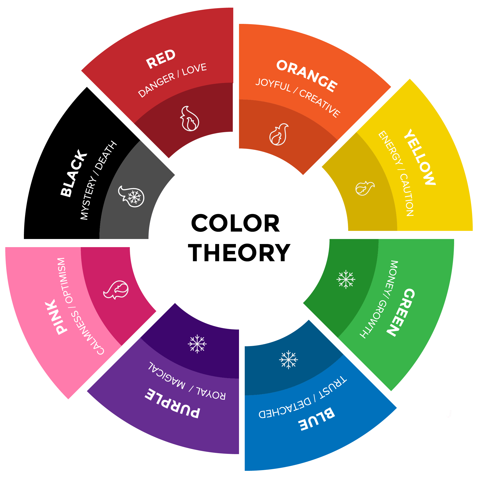
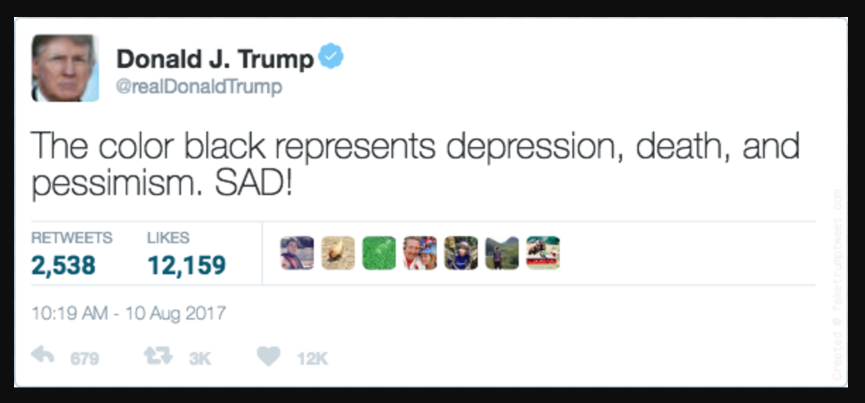
When I began researching color theory, I found dozens of articles claiming that brands MUST OBEY color theory or they will perish. I’m here to tell you that, actually, you don’t. Color can’t be restricted to certain emotions because everyone interprets colors differently. The fact that black can be both sophisticated and ominous is a good example. Black is popular in fashion because it’s strong, confident, and evokes elegance (it’s slimming too!), but it also represents depression, death, and pessimism. (SAD!)
Color theory is a great stepping stone, but it shouldn’t be the only deciding factor when doing branding.
When branding your company, it’s important to hone in on the deeper levels of why your company exists in the first place. What sets essential brands apart from the pack is that they look beyond the obvious reasoning and find the one thing that is unique to them, or their unique value proposition. At Herosmyth, we like to really focus on our clients, so we only take on 1-3 at a time, unlike most agencies that have dozens of projects going on. This allows us to give our clients the amount of attention that they deserve. We realized that this was what made us unique, and we pulled that into our branding and messaging. Only once you have nailed down why your brand exists can you look into colors to get the right combination to convey the right message.
In this article, I will go over 3 brands that break the expectation of color theory - and why it works.
1. Colorado Lending Source

Colorado Lending Source is a great example of going beyond the surface meaning when using color in branding. Yes, they do offer loans, which might lead one to think, “then why not use green or blue? That’s associated with money and trust, right?” While that would technically be correct, Colorado Lending Source doesn’t want their purpose and focus to be on “money.” In fact, they are a non-profit, so an emphasis on profit would go against their core identity.
Just because they chose not to follow the typical rules of color theory doesn’t mean that it was a poor design choice. On the contrary, it shows that they really dove deep into their branding to find the one trait that sets them apart from their competitors. Colorado Lending Source wants to help entrepreneurs and startups begin their business journey. They believe that loans should be based on more than your credit score, and are focused on finding people with good character, positive energy, and passion. They want to maintain a joyful, energetic, and determined atmosphere, both internally and externally. Taking all of these factors into consideration, I believe Colorado Lending Source chose to use red, orange and yellow because those colors best represent their brand purpose, and not just what they do as a business.
2. U by Kotex
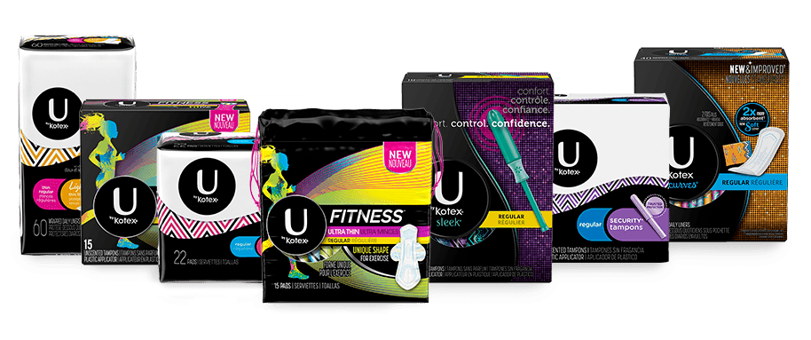
U by Kotex is another great example of “breaking the norm.” Have you ever walked down the feminine product aisle and thought to yourself, “this aisle goes on for miles; I feel as if I’m stuck in a pastel sea.” On the consumer side, this can be overwhelming. On the brand side, this can be the death of your brand. I think U by Kotex took that into consideration when they did their branding.
Most brands promote these types of products with pastel colors, showing women in light-colored dresses, twirling, dancing...(you know, the girly stuff) - basically everything that women don’t want to do when they are in the middle of their cycle. The subdued hues lend a gentle and modest feeling that goes hand-in-hand with the expectation of how women should not call attention to that time of the month and maintain an exterior illusion of being pure and pristine at all times.
For a long time, talking about periods was extremely taboo. It can still feel that way in some cases - and places - today. However, I think the shift in our culture’s acceptance of the common (and natural) issue also helped U by Kotex find and brand this new angle. They pushed the proverbial “period envelope” by making their product bold, loud, and hard to ignore. The sleek black boxes are covered with bright, colorful patterns that match the wrapping of the individual products. They have neon pinks, greens, purples; it almost looks like a rave party in a box. So...why did they take this starkly contrasting approach?
What makes U by Kotex essential is that they “get it.” What set them apart from the competition is that they listened to their consumers and realized that women didn’t relate to the standard type of messaging and branding that was currently in use. I will never forget the first commercial I saw from U by Kotex where they poked fun at all of the overused marketing strategies. I had never seen an ad like that from other brands and immediately thought that they were witty, authentic, and truthful. (These reactions of mine line up with their branding; kudos to them.) They relayed all of these feelings without relying on the use of color theory; instead, they just thought outside of the box!
People might view U by Kotex as a brand that “ignored” color theory; however, they actually took color theory and flipped it on its head. Do you think that U by Kotex would stand out or seem as honest and “real” if they followed the crowd? Imagine that you invite everyone over for a princess tea party and U by Kotex shows up as the ogre version of Fiona. That’s just who they are as a brand, and it works. Their packaging is jolting and forces you to break out of the pastel paradise. It calls attention by being different and by interpreting colors in a new way.
3. State Farm
Another company that broke the norm is State Farm.
Have you ever gotten the State Farm jingle stuck in your head? (How about now that I brought that up?)
State Farm has been around since 1922, and to this day, they are still growing bigger every year. According to State Farm’s history, their mission has been solid from the beginning: an old retired farmer named Mercherle said he wanted his business to “operate fairly and do the right thing for our customers.” I believe that, so far, State Farm has lived up to that purpose, especially in the minds of their consumers (which in today’s world is the only opinion that matters). State Farm does not have a blue logo, a color which would naturally evoke trust, yet they accomplish that same feeling through other aspects of their brand.
State Farm’s messaging is very clear from their mission statement: “our success is built on a foundation of shared values — quality service and relationships, mutual trust, integrity and financial strength.”
They realized that they didn’t have to be blue to be trustworthy; they could create that trust on their own through other aspects of the brand. I think that State Farm wanted a logo that would call attention to itself due to the cluttered reality of the insurance marketplace. According to color theory studies, red attracts the most attention out of all the colors. It’s not the go-to trustworthy color blue, but it sure does help the already-trustworthy brand stand out from the crowd. And while red also makes people mad, that’s bound to happen in the insurance business anyway, so it’s okay.
The bottom line:

Your brand is not your logo. Say it with me now: YOUR BRAND IS NOT YOUR LOGO. The biggest mistake in branding is thinking that the logo is the only form of expression that a company has, when in reality, there are many different ways to communicate with your ideal audience. Your brand is just a face; the personality of your brand shines through in the messaging, marketing, and of course, how your customers feel about you. (And if you’re struggling with communicating your brand’s personality, we do offer a one-day branding workshop to help companies find their unique purpose.)
As human beings, we feel and see color, and those feelings can be manipulated: blue can mean trust, but without any context, it’s just blue. I’m not saying that color theory is irrelevant, but it shouldn’t be the only deciding factor. Utilizing color can emphasize what makes you essential, and that is what should define your color palette.