Authored: 7/13/2017 Updated: 10/15/2021
What is User Interface (UI)?

The dictionary definition: The means by which the user and a computer system interact. In particular, the use of input devices and software.
My definition: How a user navigates and interacts with content.
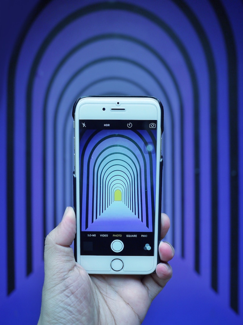
Mobile UI

In order to have successful UI, it’s important to know and understand the common gestures of mobile users, and to understand the importance of mobile/tablet-friendly sites.
Common Gestures for Mobile / Tablet:
Tap: Using your finger to tap the screen (the most common interaction)
Pinch: Pinching 2 fingers together (generally used to zoom in/out of something)
Rotate: Turning your device sideways (used to rotate the screen to be horizontal vs vertical)
Swipe: Sliding your finger left and right on the screen (most commonly used as a “next or back” replacement)
Long Press: Holding your finger down in one spot for at least 3 seconds (this is usually used to replace “right click”)
According to Statista.com, as of the third quarter of 2021, 47.74 percent of web traffic in the United States originated from mobile devices, up from 47.07 percent in the preceding quarter.
Also, the average age of mobile phone users is starting as early as 10 years old (though I didn’t get a phone until I was 16…kids these days). Due to the increase in mobile phone usage, designers are now having to shift their mindset from desktop first to mobile first.
Think about it:
Have you come across a non-mobile-friendly site? How long did you stay? Did you get your laptop out to further research that company or website?
(Probably not, but for those of you who did, you are one in a million.)
Personally, if a site isn’t mobile-friendly, I don’t think twice before leaving.
Unlike a desktop or laptop, tablets and mobile phones are touch screen-based devices. Not only is the way that users interact different, but the size of the screen is much smaller, too. This changes the way that you would lay out buttons and links. You are also switching from a horizontal layout to a vertical layout.
It will not matter how “cool” your interactions are if users can’t figure out how to navigate your site.
They will get frustrated and probably complain to other potential customers about your site’s lack of usability. (Keep in mind: negative experiences tend to stay longer in our memory than positive ones, too.)
Desktop UI

Desktop is still a common way in which users visit your website. Usability for a desktop can be even harder than mobile usability. This is because there is a lot more surface area, so it’s easier to get lost in design and forget the importance of guiding your user.
Users should never have to ask themselves what the next step is; all calls-to-action (CTAs) should be mindless.
For example, if you go to any ecommerce site, the first thing you see is usually “SALE!! - CLICK HERE!”
Right away, the user is pushed to where the client wants them to go.
Common Desktop Commands:
Left Click: used to select items
Right Click: used to open additional options
Hover: holding your cursor over an item without clicking
Keyboard: can be used to navigate, and can be used for shortcuts (ie. copy and paste)
Scroll: moving up and down a page
How does one find the balance between unique sites and usability?

The Basics
1. Establish the purpose of your site.
It’s easy to get lost in design elements, photographs, typography etc. However, the reason clients want traffic to a site isn’t for users to admire how pretty the site is. There is usually some sort of end goal, whether it’s signing up for something or purchasing a product; the motivation behind every decision should help your user reach that end goal.
2. Always map out your design.
In the beginning phase of every website, it’s important to make a wireframe. Wireframes are your guidelines to creating a map for users to follow. When making a wireframe, it’s important not to get hung up on colors, typography, or any other design elements. Wireframes are best used to lay out content on a page. They are used to establish the flow of information to help the user reach the site’s end goal.
3. Strong CTAs.
You never want a user to get “stuck” on a page. If you have impeccable UI, the user should never have to use the back button. Strong CTAs should always be easy to see and should necessitate an action. To help establish strong CTAs, keep in mind the size, placement, color, and wording (eg: instead of writing “send,” write “send message.” This way, the user knows what they are doing).
4. Site Navigation.
If a user can’t figure out how to navigate your site, then there is no point in having one. A good navigation will allow users to roam your site based on instinct, without worrying about where to find something. You won’t be there to tell them that this really cool icon leads to that page, so keep your navigation simple, clean, and most importantly, functional.
5. Readability.
Typographical elements are a great way to bring some personality to a site, but if the user can’t read what it says, there is no point in having it. Type is very important - especially when it comes to web design. I’m not just talking about having cool headlines; body text is very important as well. Users have trouble reading through content if it is too wide or narrow. The end of every sentence is like a break for your eyes. If the user doesn’t get a break, they will get tired from reading your content; on the contrary, if the type is too narrow, it creates a strange, fast rhythm as the user reads the content.
If you have impeccable UI, the user should never have to use the back button.
With all of these rules to follow, how do you make a unique, user-friendly website?
It’s simple: start with the basics, and then bring in your client's personality. You can add a touch of personality through color, photographs, and layout.
Adding Personality
1. Font Choices.
If you have the luxury of using a custom font, then you are already set apart from the pack. Unique font pairings can also help bring a sense of personality to your website design. Stay away from “trending” fonts and really dig deep to find one that speaks to your client.
2. Color.
Finding the right color combinations makes a huge impact on usability and unique design. It’s very important to pick colors that speak to your client but also demand attention. It’s better to have one or two colors that really stand out; this way, the user will associate that color with an action. Having an overly colorful site can look amazing, but it will be much easier for the user to get lost if it gets too busy.
3. Layout Grids.
Create a grid for yourself. You can overlap elements and play with size and space as long as it fits together. If you eyeball where you want things to be placed in a site, it can be cluttered or too empty. Creating a grid allows you to play successfully with positive and negative space.
4. Messaging.
Creating a voice for your website is just as important as creating the visual elements. Having strong headlines and meaningful content will give users a sense of who the company is on a deeper level, building a more authentic connection. Having the right messaging gives the website personality, and it also helps the user to navigate your site by guiding them through the purpose of why the website exists.
Bottom Line

In the words of Mike Matas,
When there's that balance between functionality and emotion, the two amplify each other and the result is really powerful. I'm always trying to get there when I'm designing.
Mike Matas
Always keep the basics of UI in mind, and have fun designing a site that is unique and user friendly.


