Did you know that there are over 500,000 fonts to choose from?
This exhaustive list of typefaces is just the beginning. With all of these choices buzzing around, how does a designer choose the correct font to match the style and message for their work?
First, let’s clarify what fonts are.
Fonts can be broken down into families: Serif, Sans-Serif, Slab Serif, Script, and more. These can then be further broken down into subfamilies, such as Western, Retro, Modern, Classic, and more.
Typefaces are the names of specific font families which are clustered together based on having similar design features. Some of the most common typefaces include Times New Roman, Futura, and Tahoma.
What makes one stand out from the other?
Well, let’s get into what differentiates font families, starting with the key detail: the main two font families are Serif and Sans-Serif fonts.
A classic Serif font is Times New Roman, found on every word processor out there. If you break apart the letters (pictured below), you will see that the ends have embellishments that vary in weight, making the font easier to read. Serif fonts are typically used as body text because they don’t lose legibility based on scale.

Sans-Serif originated from the Latin word “Sans,” meaning “without,” and the Dutch word “Serif,” meaning “line.” A Sans-Serif font is composed of simple strokes that don’t have any embellishments (pictured below). This font family became popular when design styles became more minimalistic. One of the most popular San-Serif fonts is Helvetica. Sans Serif fonts are used mainly for headings but can be used as body text as well.

Both of these styles are legible at a bigger size, so if legibility isn’t a problem, why choose one over the other?
Well, there have been a few psychological studies that show different typefaces influence how people “feel.” So, above all else, choosing a typeface can change how your typography is received.
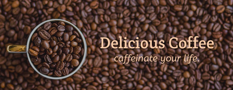
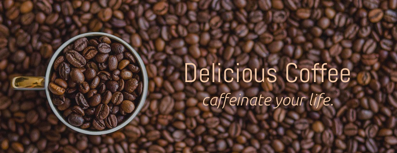
To illustrate this example (literally), take a good look at the images below and watch how the fonts change your perspective on the same ad.
What do you feel when you look at these ads? Can you picture the type of coffee shop it would be or the atmosphere they would create? What kind of people would be attracted to the brand?

This heading typeface is called Pacifico. This is a script/display font—typically, this font family generates feelings like creativity and amusement. This typeface gives a feeling of an upbeat, slightly hipster coffee shop, maybe decorated with bright couches and fluffy pillows. This seems like the typical place to casually catch up with friends.

This header typeface is called Crete Round. This is a Serif font, which tends to exude feelings of tradition and comfort. Based on the font choice, this ad gives off a more business-like vibe. It would most likely be decorated with dark, hand carved wood, and possibly have some tall, antique chairs as well. This might be the weekly place for a business meeting.

The typeface used in this heading is called Abel. This is classified as a Sans-Serif font, so it tends give off the feeling of being progressive and modern. This type of coffee shop would feature sleek, clean lines and a very modern appeal. Maybe the building would have a lot of floor-to-ceiling windows. It would be the type of shop for people to come in and work or read; a quiet place to get away from the chaos of the outside world.
Did you know that, on average, web visitors judge your entire company in 3-5 seconds? They spend longer using hand sanitizer!
As of now, we have learned about different font classifications and how they make you feel. How can this be applied to the marketing world?
In these 3-5 precious seconds of quick website judgment, your customers are getting a sense of your company. They want to know why they should pick you over the competition:
Do you have the best product in the industry? Is your brand personality or voice attractive to them? Is your copy compelling enough to get them to understand how your brand can help them?
However much weight these factors have on their perception of your brand, the most important feeling they want to get from your site is authenticity. Essentially, they want to know if they can trust you.
With so much riding on those initial 3-5 seconds, it is essential to have a well-designed website that prioritizes these feelings.
Part of creating compelling design is to use fonts that speak to your audience. Typography enhances the effectiveness for email campaigns, websites, ads and more!
If you are a marketing manager and your company sells whimsical coffee mugs, you might want to use a script or display font family so that the web visitor automatically feels a sense of amusement and fun from your design.
If you are a small business owner and are selling cigars, you might want to consider using a Serif font family so that the user feels a sense of timelessness and reliability.
Now that you have a good background on fonts, let’s touch on why people think Serif fonts are dying.
Most articles that focus on the “top typefaces” to use mainly feature Sans-Serif fonts.
Why is this the case?
Generally, the design styles of today are starting to become more minimalistic and modern. Due to this movement, creating natural feelings of simplistic and clean design require the use of Sans-Serif fonts a lot more frequently than Serif fonts. The styles of today are moving away from rigid tradition and into a more modern, casual world.
So, are Serif fonts dying? I don’t think so.
Plenty of thriving brands, especially ones that are considered "luxury brands," rock the Serif font style: Gucci, Tiffany & Co., Hennessy, and Rolex are just a few examples of many.
Even so, I think that the minimalistic style is trending right now, but we will always need several font families to help create the perfect feeling to attract the ideal customer.
There is no absolute right or wrong answer for which typefaces is best—what's best for your brand is whatever font resonates with the "feeling" you are trying to create for your customers.


