
Can you feel it?
The crisp fall air, the cool breeze gently brushing your cheeks, the sound of leaves crinkling underneath your boots…
It’s that time of year again; it’s pumpkin spice season.
Just in case you couldn’t tell that it has begun, take a look at every major food chain and you’ll quickly find some sort of pumpkin spice-themed treat to warm your fall-loving soul (or, at the very least, bring out the basic in all of us).
Even though design isn’t something you can actually taste, we have our very own “pumpkin spice” for the 2017 fall season trends, and I’m here to break them down for you.
Color
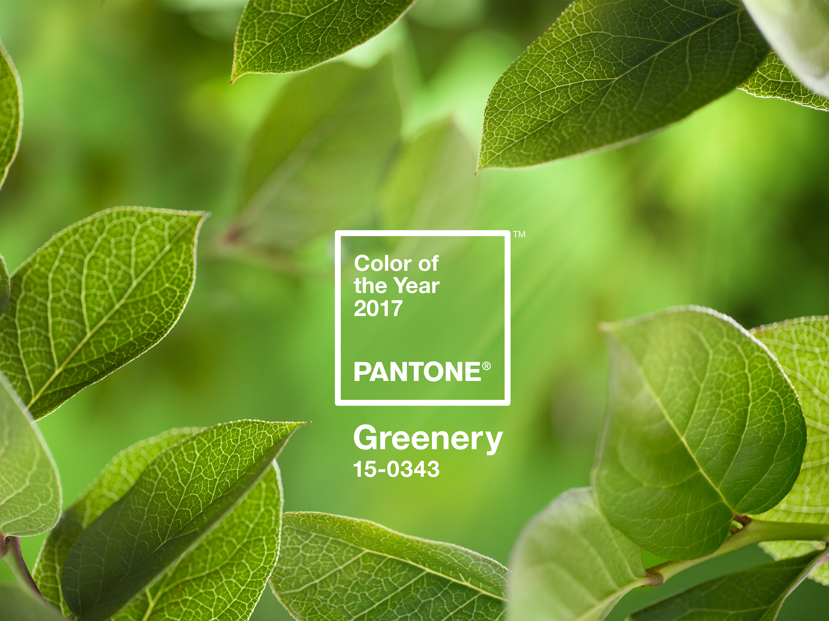
Have you ever thought about why the “Pantone of the year” is what it is? Is it because people like it? Why would this color be trending? How do we even pick trends?
Well, it turns out that what people like about color in general is how relatable it is to ongoing events happening in their lives. The pantones of the year for 2016 were Serenity & Quartz. These were chosen because, in a chaotic and overall bleak 2016, society needed an escape through the virtues of peace and harmony.
In 2017, we started to notice different trends that inspired the pantone color for this year, Greenery 15-0343. This color choice was influenced by movements that support being environmentally friendly, going (seriously) organic, gardening, and a craving for authenticity in brands.
Oddly enough, one of the influences for this year’s color choice was the Paris Climate Agreement, where 195 countries agreed to reduce carbon emissions and help move the planet toward a more “green” future. Even the little things, like the popularity of avocados, kale, and succulents, helped to push for the color green to represent 2017.
Green may be the pantone color of the year, but bold colors are also dominating this year’s fall scene. Today, our users expect design to be purposeful and easy to navigate.
This is partially due to Google, which came out with a “Material Design” that uses bold colors and spacial layouts to help bring focus to the user. Google’s material design has influenced how we use color and contrast to easily nail down where we want the user to interact and how.
The use of bold colors spans all aspects of design, including fashion, print, packaging, and digital.
The tricky part to using bold colors is that they should still be minimal. What I mean by this is that it’s best to pick a few hues and use them sparingly to add pops of color to your design.
It’s important to be aware of spacial hierarchy when going bold because you don’t want the colors to dominate your design; you want them to enhance the user's experience. They should help drive the user's attention to the right place to achieve the goal or purpose that you wish to accomplish with your design.
For example, in web design, it’s good to use pops of color consistently for CTAs (calls to action). Using the same color over and over will help to associate that color with an action. This will help the user to better understand where you want them to go and what you want them to do.
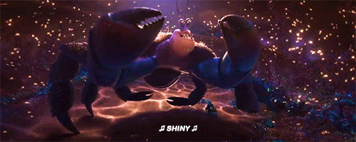
Another popular “color” trend for design is the use of metallics. This is most common in print, packaging, and fashion.
Metallics are often paired with minimal design; for example, if you wanted to spice up your packaging, you could add a metallic gold icon with a splash of color. These two work hand-in-hand, creating a modern, sleek design that will catch the attention of consumers. Metallics add a bit of sophistication to your design and help it maintain a polished look. (Besides, who doesn’t want to be shiny?)
Patterns
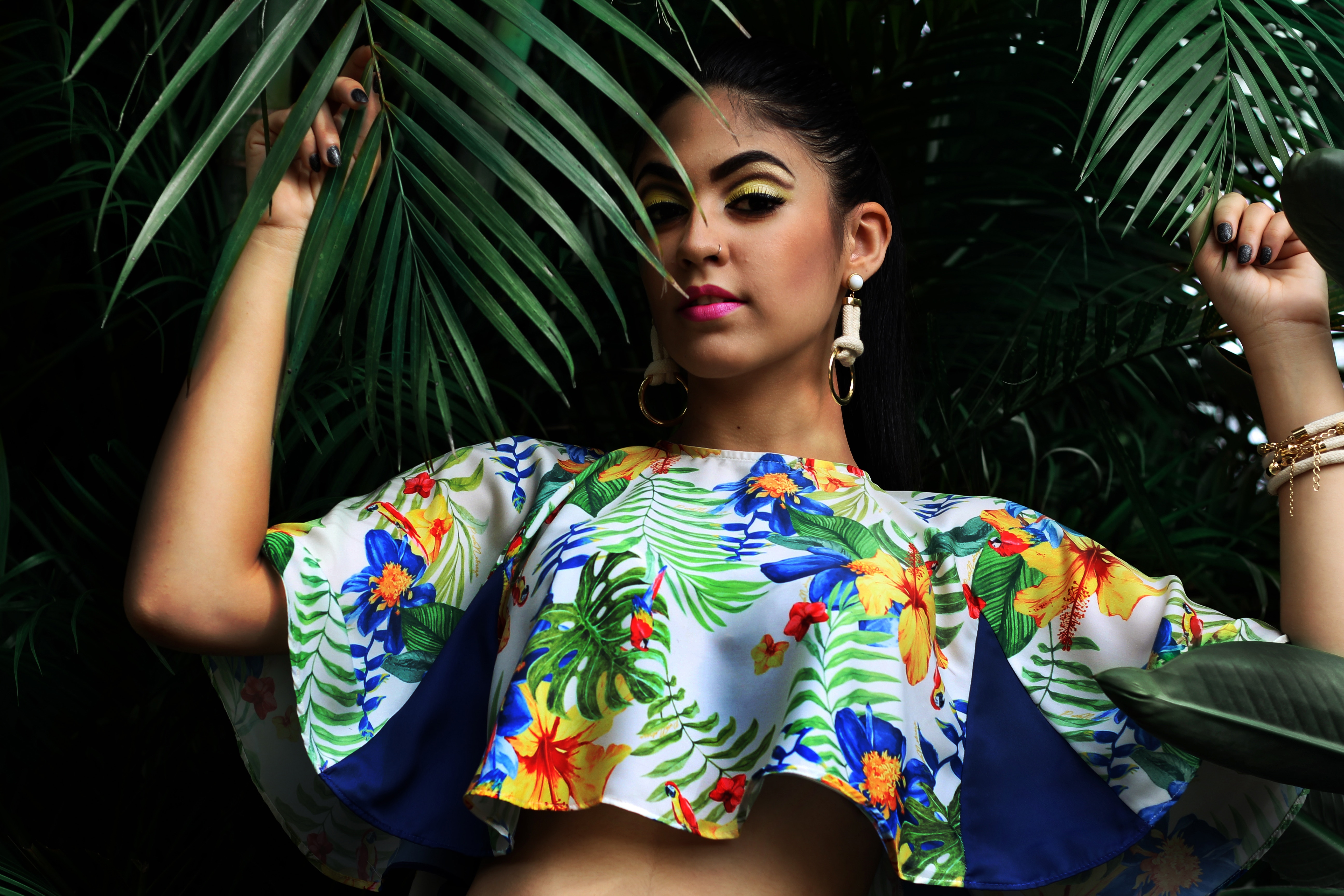
Succulents really blossomed this year (how punderful). How many succulent gardeners have you seen this past year via social media?
The social movement of wanting to be more connected with the outdoors has also influenced color and patterns for this season. Some popular trends include making patterns out of plant leaves, flowers, or even marble and stone.
However, to make these patterns modern, they are simplified and combined with bold colors and sleek typography. When creating patterns, it’s best to omit anything that isn’t necessary for helping viewers to understand what they are looking at. Highly detailed patterns can make your designs look dated, while simplified patterns give off a more modern feel.
These trendy natural patterns are very popular in interior design, print, and fashion.
Another popular trend this year is geometric patterns, a continuous trend from 2016. Most of the time when designers use geometric patterns, they are symmetrical, which is another ongoing trend from the past year.
Oftentimes, geometric patterns are used for packaging and fashion. It’s still important to consider focal points when using geometric patterns: always remember that white space is your best friend—keeping this in mind will help make your work more modern.
Retro Logos
The biggest design trend this year is all about portraying authenticity. Consumers care deeply about how brands represent themselves, so they only associate with brands that speak to their personal beliefs and identity.
This is why retro logos have become popular. Back in the ol’ days, before we had advanced technology, all logos were handcrafted, which is what gives brands a sense of being authentic.
Not only do retro logos bring back a sensation of handcrafted authenticity, but they appeal to both young and old consumers alike.
The youth of today enjoys retro-styled logos because they feel it’s easier to connect with the company. Having a more personalized logo gives off the vibe that the company is honest and trustworthy. Older generations enjoy logos inspired from the 60’s and 70’s because it brings back a sense of nostalgia.
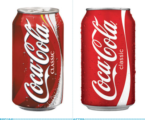
Coca Cola has done a great job of modernizing their brand without losing that authentic touch: they have maintained the hand-lettered logo, yet adjusted the packaging to appeal to today’s design standards.
Finding the balance between old and new can be tough.
One of the best ways to achieve the retro style is to pair a bold color palette with classic typography. The combination of color, space, and type allows for the old styles to shine while adding a modern touch.
It’s also good to keep in mind that less is more. If you have the ability to simplify an image, that will be the best way to achieve a sleek, retro design. Less is more, always.
Bold Ads
Bold seems to be the motto for 2017. A lot of ads this year have featured bright, beautiful imagery paired with bold, sleek text.
If you want to play with this style of ads, I would suggest keeping your text minimal.
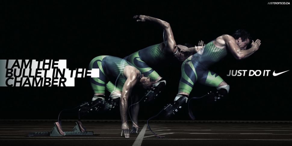
Nike is a great example of mastering this pairing. Their slogan “Just Do It” is short, concise, and when it’s paired with impactful imagery, it creates a powerful message.
Another takeaway from Nike is that they make the customer the hero. Their ads focus on “real” people going out and pushing themselves to be better, making it easier for consumers to connect with the brand message.

Another popular trend for ads is movement, particularly in the form of cinemagraphs, which only have one part of the image moving while the rest is like a photo. Ads have really taken to motion this year because it catches the consumer's attention in such a cluttered marketplace. You want to be careful with how much motion you use in a digital ads, however, because you don’t want the consumer to have a hard time digesting the purpose of the ad.
Final Thoughts
The pumpkin spice of 2017 is about being bold yet minimal.
Negative space and sleek text paired with bold colors, patterns, or imagery will help you stand apart from the pack while embracing the trendiest of design trends.
Remember to bring the outdoors in and stay true to your brand.
Transparency is the key to successfully connecting and keeping ideal customers.
And on that note...
Happy fall, y’all!
What are your favorite trends of 2017? What do you think will be popular next year?
Share your thoughts with us in the comments below!