
As we enter the fall season, retailers are getting overjoyed to pump out their pumpkin spice-inspired merchandise—you can get it in a latte, candle, coffee, ice-cream, tea, and so much more. Pumpkin spice always takes over this time every year.
So what do marketers and designers have as their go-to fall move?
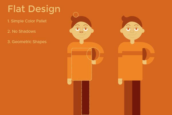
1. Flat Design
One of the most popular design trends right now is Flat Design.
If you look at websites, ads, articles, infographics they all have similar elements. Flat Design isn’t just trending for Fall, it is one of the leading forms of design at the end of 2016.
For those of you who aren’t familiar with the term “flat design” it basically means that every element is on the same plain.
Flat design tends to avoid the use of shadows, highlight and gradients. Which is why the designs feel “Flat.”
Also Flat designs tend to use minimal color pallets. A lot of this was influenced by the Google Materials Guide released back in 2015. The color palettes tend to have 3 primary colors and 1 accent color.
Another interesting aspect of Flat design is the use of geometric shapes. Flat Design typically uses geometric shapes to build other objects. Including people!
One last element typically associated with Flat Design is the use of a grid system. Due to the fact that most elements are made using geometric patterns is it essential to have them on a grid. This ensures that the negative space compliments the positive space used in a design.
Also Flat design works well for illustration, infographics & print. It started to show some weakness in the UI/UX field.
A prime example of poor flat design was Windows 8. This interface was one of the most complained about in 2012. Users hated using an entirely flat interface.
Why? Flat Design is made to be simple and user friendly right?
Wrong, without the use of depth or hierarchy users were totally lost. Consumers didn’t know where to start when they were presented with the grid system icons.
This leads us into the newest form of Flat Design for Web Designers.
2. Flat 2.0
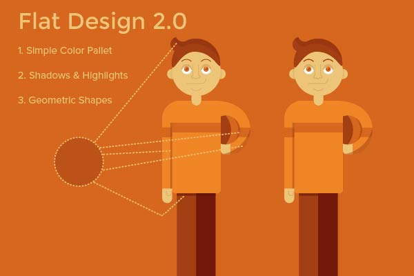
Flat 2.0 is a combination of Flat Design with the use of 3D.
The 3D element is key in Flat 2.0. This allows designers to create depth and hierarchy to better steer the user. The simple use of a drop shadow helps elements lift off of the page and beg for attention.
Flat 2.0 still maintains some of “Flat Designs” primary elements. For example the use of color hasn’t really changed. Designers are still sticking to a minimal color pallet.
Having one accent color makes a big difference in web design. If you associate the color with a “call to action” it makes navigating a web page so much easier.
For example, every time you see a link it is blue. This association of color tells the user if I see blue I can click on it.
Just integrating depth in Flat Design has opened the door for future minimalistic websites.
3. Advertisements
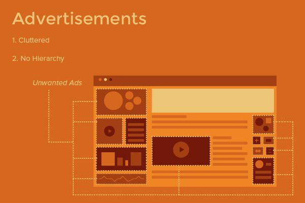
Flat designs also help reduce the clutter on a web page. Whether you are a consumer, business owner or designer we all have one thing in common… no one likes ads.
At least not the typical boxes that take up room on our screens...
The way people view advertising is changing. For example, snapchat has filters that allow the consumer to interact with a product. When a new movie comes out there is a least one filter on snapchat that allows you to be apart of the movie.
One popular Ad trend is the use of motion. Ads are becoming less stagnant. Most feature a short animation, or giphy element.
Some are video ads that feel more like a short movie rather than a sign with a picture and some text.
Ads are also starting to focus more on empowering the user.
For example the iPhone ads are trying to show off their new low light camera, but the way they did it was genius.
Instead of having a commercial that runs through a list of why this camera is great, they empower the user by showing how they would put this low light camera to use in their everyday life.
Another great example is Corona. “Find Your Beach.” This slogan is 100% empowering the user. Their ad says, we will help you get to your happy place, not we are the best beer because of xyz.
4. Navigation
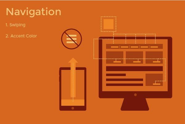
When responsive design first became popular the most overused element in designs was the “hamburger” menu. This allowed users to access the same menu no matter what device they were using.
The issue with this menu is that it wasn’t integrated into the design. So the user felt like they needed to take extra clicks in order to get to where they needed to be.
Constantly being able to test prototypes with real users has allowed designers to make strides in the Ui/UX field.
We now know that users have little to zero patience when it comes to navigating a website. If they can’t figure out how to move forward they will lost interest immediately.
So we’ve used that knowledge to help develop apps and websites.
Swiping has become much more popular as far as navigation is concerned.
This is because Users tend to feel detached when they click on something, where swiping allows them to feel apart of the action.
Have you noticed how often you swipe on certain apps as opposed to others? Which one do you use more often?
5. Responsive Design
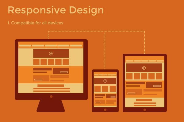
With our technology advancing every day Responsive Design has become a MUST rather than an option.
Think about your daily routine? What are the 3 main things you can’t leave your house without in the morning?
For me it’s Wallet, Keys and Cell Phone. Despite our best efforts to not become attached to our phones we all know the minute we can’t find our phone, immediate panic sets in.
We use our phone to text, send emails, stay in touch with social media, run apps, browse the web and so much more.
If you have a site that isn’t responsive chances are you are losing out on customers. As I stated before if they get frustrated they will leave and check a new site. One that is more aware of their User Experience.
Responsive design isn’t just limited to websites, it also pertains to logos and advertisements. If your logo looks like a small blob when it’s on a mobile device then you are automatically losing out on consumers.
Flat design goes hand in hand with responsive design because it is based on elements that are easily scaleable.
5. Holiday Elements

With pumpkin spice comes the fad of hand lettering. Now don’t get me wrong, hand lettering is more than just a fad. It takes hard work and a dedicated designer to become an expert in this skill.
However, around the holiday season you will notice so many ads that feature blissful hand lettering elements.
My handwriting is terrible so maybe people like me are attracted to this because it seems so “magical”
More specifically it’s not just hand lettering, but mainly hand lettering that looks like it was written in chalk.
Another popular element is “Food Type” this is another skill, where designers will create a message out of food or objects relating to the message they are trying to convey. (Especially with Holiday lights.)
In my opinion one reason why Hand lettering is so popular this time of year is because of it’s authenticity. No one will have the same design as you because it’s an element that cannot be copied.
Conclusion
These core elements will help elevate any design. It is important to keep up with color trends, social media and fashion because they all influence one another.
So what is the pumpkin spice of design? Well it’s a mix of everything above. All of these elements put together to create the greatest pumpkin spice design that you can imagine. But unlike the pumpkin, design isn’t seasonal. These trends will last longer than the leaves on the trees.