
In a recent article, I wrote all about everything you need to know in order to plan, test, and optimize your own stellar CTAs. If you're already familiar with CTAs, let’s go ahead and dive into some real-world examples to get the inspiration flowing.
INVISION NEWSLETTER: SIMPLE AND CATCHY
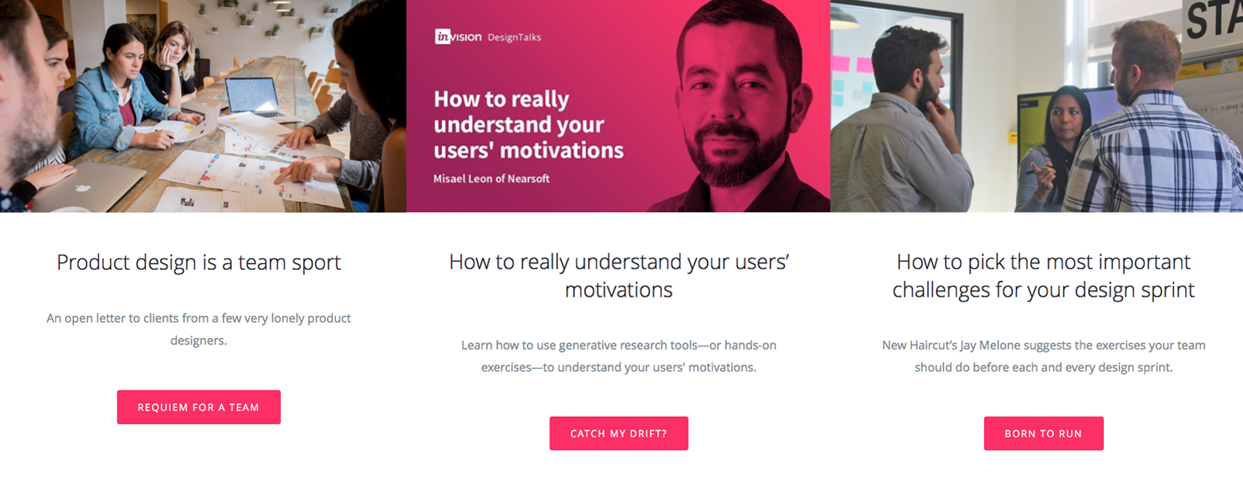
Not only does Invision do a great job of rounding up useful content for their customers who want to improve company-wide workflow, but they succeed at being catchy at the same time.
Invision uses a simple, vertical layout with plenty of white space, which makes their hot pink CTA really pop. Not only does the color draw your eye, but they succinctly sum up the topic in three to four words, usually with a clever idiom or play on words - it’s hard not to smile and even harder not to click when the button is so intriguing. Kudos to Invision for creativity with space and copy.
RAREFORM PRODUCTS PAGE: REFERRAL REWARDS
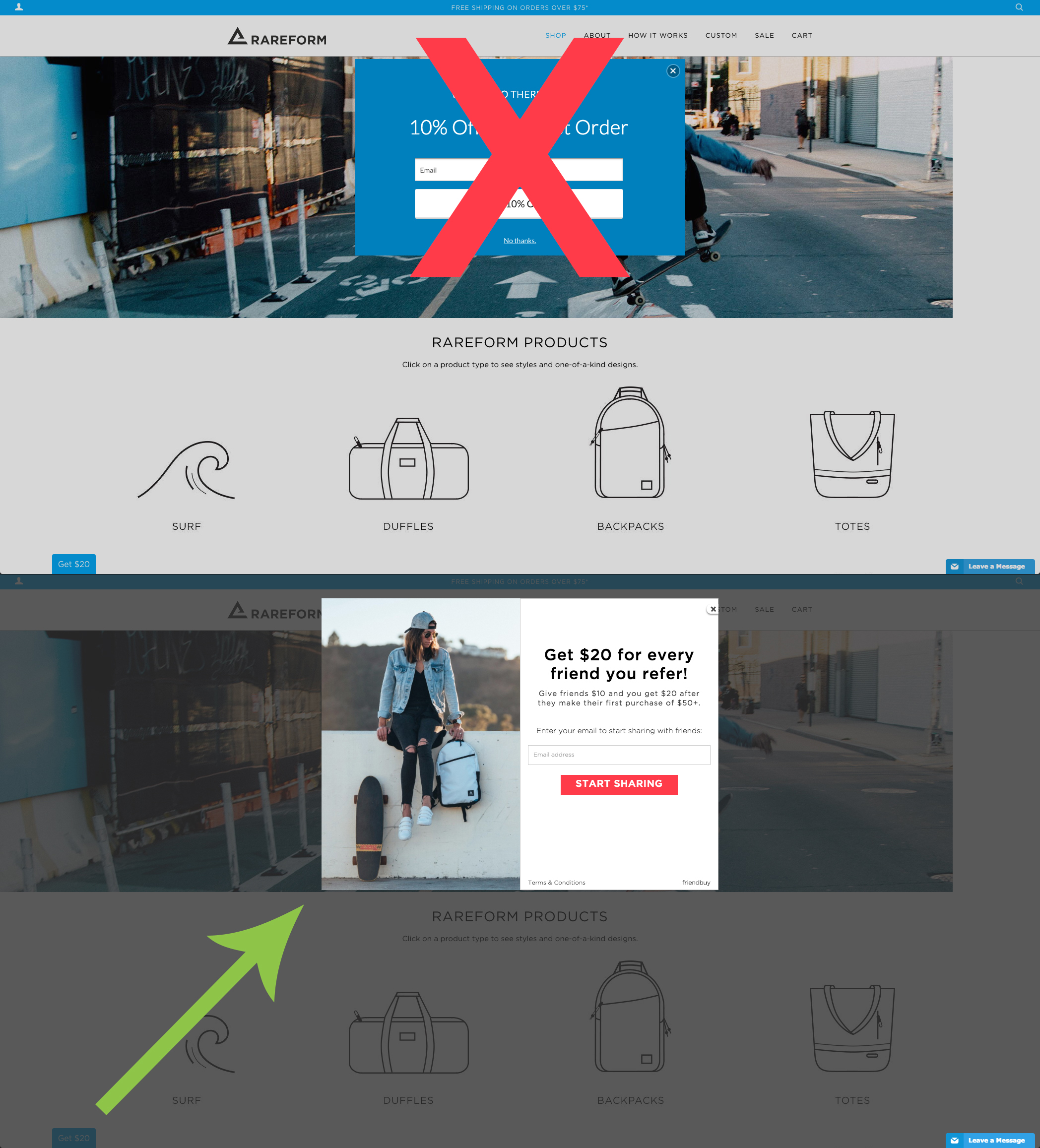
Having been founded in 2012, Rareform is still a pretty new company. That said, their products may not be very well known to the usual consumer, so when you visit their online shop, a pop-up with a discount takes over the screen. Now, as I mentioned in the optimization section of my first CTA article, this may be a bad move, since users are not yet familiar with the products and may be reluctant to give up their email in the case that they don’t make a purchase. Some may even consider this to be an extremely annoying CTA, too, since it blocks out the screen until an action is taken.
However, Rareform compensates for this pop-up with another clever and blissfully simple CTA at the bottom of the page: get $20. Who doesn’t want an extra $20, and even more importantly, what user would pass up an opportunity to get paid by a company that’s trying to take your money? The CTA is simple, enticing, and opens a pop-up that clearly explains how to claim your $20 by referring a friend - which also helps Rareform’s (digital) word-of-mouth marketing. Win-win.
STRIPE: COLORS AND CHOICES
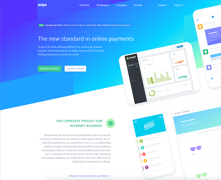
Stripe’s website is just so...pretty. The colors are soothing, and the use of bright, greenish gradients introduces the vivid - but tastefully matching - green button. The copy clearly explains what the company does and establishes its value in the industry to help convince users that they need it.
My favorite part, however, is the two CTA choices: either you’re sold and are ready to create an account, or you have questions. Lots and lots that you cannot or don’t want to search for the answer to, and Stripe gets it - the “contact sales” CTA helps retain users who are on the fence and need answers. A great way to eliminate some drop-off is with a comprehensive and all-encompassing CTA.
EXTRAORDINARY JOURNEYS: PERSONAL TOUCH

Working with Extraordinary Journeys on redesigning their website, our co-founder Chad had an epiphany: instead of just a contact form, users will feel more personally catered-to if they have a guarantee of getting quality one-on-one help from an expert, not just some bot or semi-knowledgeable customer service rep. The CTA invites you to connect with your personal travel expert, which is much more warm and welcoming than just connecting with, well, whoever it may be on the other side.
The copy runs through questions the user may be pondering and how Extraordinary Journeys can tackle them with you. This sets the stage for the user to understand that Extraordinary Journeys is in sync with the customer and truly understands her needs.
The personal touch here brings an additional level of value to the CTA than just “contact us” on its own, which makes it more enticing for users to click.
WISHPOND: VALUE OFF THE BAT
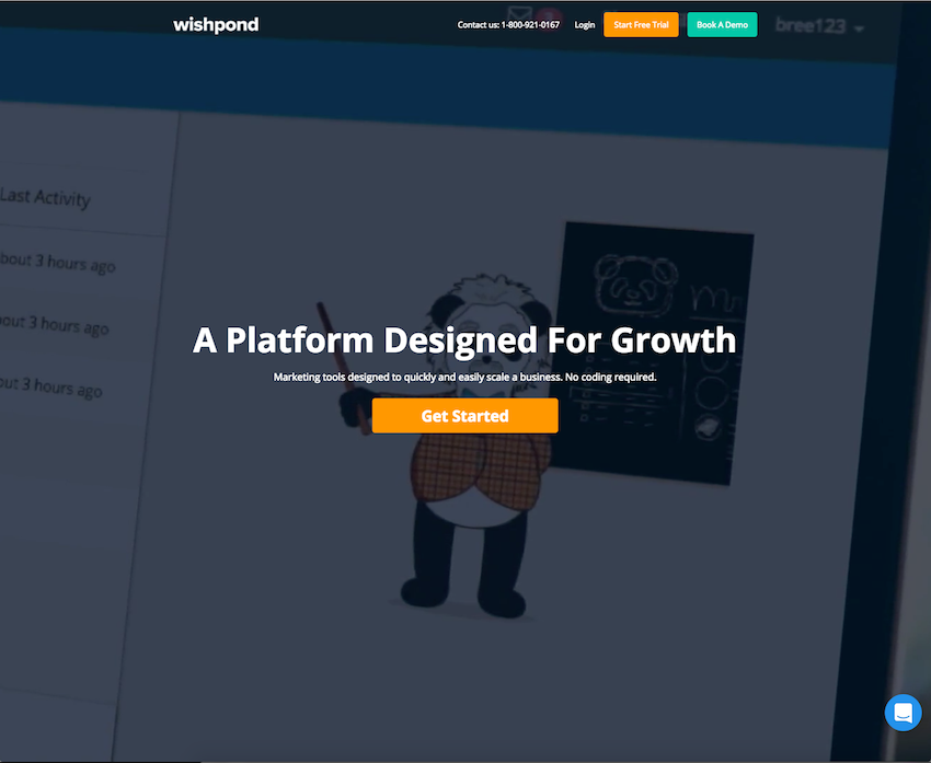
The headline is clear, and the subtitle hits the key values head-on: quick, easy, scalable, no code required. Sounds like something that virtually anyone could do, right? That’s the point: Wishpond gets that their target audience is busy and probably aren’t coders, so they encompass these in the CTA to clear up any doubts or suspicions of what Wishpond does and how users can benefit.
Even better, if someone is still hesitant and doesn’t see how Wishpond can benefit them, they have 2 more CTAs at the very top with an option to get a demo. They cover all their bases by catering to those who need a clear explanation to be good to go, and also those who need a hands-on experience to be convinced of the value.
COSCHEDULE: CLEAR AND CHALLENGING
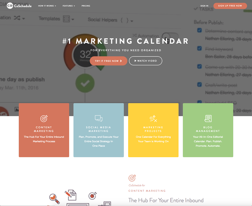
They’re number one in what they do, they keep you organized, and you can get your hands dirty and try it yourself before committing. CoSchedule nails all the right elements of their CTA to gently warm you up to the idea, and they even have nice, colorful blocks underneath to further delve into every aspect of marketing that the service helps with. Basically, if you look at CoSchedule’s home page, you can quickly and easily gather the necessary information to make a purchase decision.
The copy claims that CoSchedule will organize everything, which can entail a challenge to the user: he may say something like, “how so?” or “oh yeah? How about this?” but either way, the CTA invites users to test whether or not the claim is true, which means giving their service a chance, equaling a win for CoSchedule. The fact that there is a free demo version establishes CoSchedule’s confidence in the effectiveness of their service - they present a challenge and welcome you to try it for yourself before dishing out any dough.
Herosmyth: COLLABORATIVE LANGUAGE

Not to toot our own horn, but our own website has a great little CTA example as well. Rather than just plainly asking users to contact us (and hope that we’re a good fit for their needs), we explain why they should start a project with us. The headline captures the value of the message: working together. This concept takes the idea of an agency working on your behalf and turns it on its head - working together emphasizes the importance of the client’s input and puts them in the driver’s seat of their goals.
The body text introduces the idea of where and how Ascend can take your brand forward, which sets up the actual CTA button, “get started,” as an action users can take to confirm that Herosmyth can give them what they’re looking for with no confusion or misleading promises.
Note: a badass photo of a surfer catching some serious air helps attract attention to the CTA, too.
SEARCH ENGINE WATCH: POWER OF POSSIBILITIES
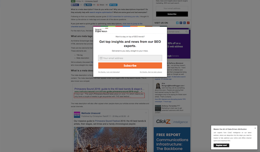
Oftentimes, pop-ups present limited actions for the user: sign up, guilt trip until you finally sign up, or exit.
Search Engine Watch does it the right way by increasing the number of options - without increasing stress, too. Say you check out one article, and before you get a chance to browse more, the pop-up (pictured above) takes over the window. If you choose not to subscribe now, Search Engine Watch provides two options: not interested or maybe later.
This is great, because it lets new users revisit the possibility of subscribing when they’re good and ready, and also allows users to clearly indicate when they would rather not be bothered again by the offer. Their CTA is likely more effective than usual by giving the user all the right choices to catch them in one stage or another: sign up now, later, or never.
Recap
There are tons of examples of great CTAs, but the ones above cover many important and useful tricks to increase the likelihood of a click, or conversion.
To summarize:
- Keep it simple and clever so the CTA really pops
- Incentivize buzz via referral offers
- Use bright colors for CTA buttons to draw the eye
- Use personable language to speak directly to individual users
- Emphasize the value of the CTA to relay usefulness
- Keep the CTA clear and present a challenge that inspires action
- Accentuate the importance of the user’s needs by using collaborative language
- Provide options for the offer to cast a wider net
What are your favorite examples of CTAs? Have you tried out your own? Share your thoughts with us in the comments below!