
Okay, I am a fellow gamer and I will totally geek out in this article. (yee be warned…)
The main focus of this blog
Ps: This will have spoilers.
Psychology tells us that we remember how things make us feel, even if we don’t remember the event itself.
As I played through the new release, I realized something new about myself; I’m even nerdier than I thought.
The entire time I was playing Journey I could not stop noticing the intuitive user experience, and of course the gorgeous visual design. Everything has a purpose, and they all lead you to keep exploring the game, and achieving small goals until you reach the final goal — the top of the mountain.
Playing through Journey made me think of web design for multiple reasons:
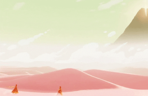
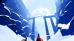
A new world for the user to explore
In Journey, they handle this aspect really well, there is a short intro of a shooting star from the mountaintop that the player is witnessing for the first time, and as you are seeing this happen you are also getting an idea of the landscape around you. The ending highlights 3 poles in the ground indicating that this is where the player needs to go. This is reinforced in the actual gameplay when the camera is angled at the same spot.
A first time user has never seen your website before, so you have to make the homepage as intriguing as possible to get users to explore the digital world that you have created for them.
They need to know three things right away:
- Where are they
- What is the purpose
- What do they need to do from here
In order to handle this in web design you can do a few things:
- Establish where they are by having a logo of the company in the navigation bar, and a banner headline (usually the tagline) that captures the essence of your website.
- The purpose can be defined by the subtext in a banner (usually this is a value proposition) that will inform the user as to why this website exists.
- You can push users toward your initial goal with a CTA. If you are an e-commerce site you might list a sale right off the bat, or a new product. This will guide the user to the next goal — which will hopefully lead to the ultimate goal; a sale.
- The fold. By having information peaking at the bottom of every page fold it will inform the user that there is more to find if they keep scrolling.
It has to be intuitive
There are very few controls for Journey, which is why it’s an easy game for anyone to play. In the very beginning, you can only walk, and change your camera angle. The first chapter focuses on these two aspects of the game so that the gamer can get familiar with the controls.
Journey draws the user into the first checkpoint by having movement, and light focused in one area. In the distance, the user can see a swirl of scarf pieces on a ruin, and a white light shines once your character is close enough. Once you reach the first checkpoint you learn to speak and jump (which are the only other two controls for the game.)
So within the first 5 minutes, you’ve learned where you are, and what you can do. (Without a single word of text!)
This should also be applied to your homepage. Seeing as users tend to make a decision in about 3 seconds, you don’t have much time to capture their attention. Users don’t want to aimlessly explore your pixel paradise, they want to get the information that they came for—quickly.
Web design is capable of guiding users with its very own set of visual cues.
Typography:
Using hierarchy in typography is imperative when guiding a user to the next destination. People tend to scan text, so it’s important to design the type in a way that makes scanning easy. Also, readability is key for engaging users on your site. Try to keep paragraphs to about 60-70 characters per line, and adjust your leading to be between 1.2—1.5 x Text pt.
Example: If your body text is 18pts. My leading should be at most 27 (1.5 x 18 = 27.) This will make the text easier to digest and keep users on your page longer.
CTA’s
Bright colored CTA’s are a great indicator of what to do next. (Think of them as your own set of swirling scarves.) Typically all CTA’s have a hover state, click
The wording of your CTA’s is important too. Users don’t like to click on things when they don’t know what will happen. So it’s important to be specific with what your CTA will do.
Example: If you have a form, it’s much better to have a CTA that says “Send Message” rather than just “Submit”
Animation
Sometimes animation can highlight an area of a page, but you want to make sure that it’s not distracting. I’ve talked about the usage of animation in a previous article.
Consistency in rules:
This may seem obvious, but it’s easy to lose track of. When playing a game the circumstances may change, but the gamer knows their limits.
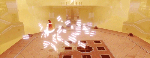
In Journey, you have a scarf that lights up when you speak to the swirling scarf pieces (or other cloth creatures throughout the game.) The charge allows you to soar; however, as soon as that light runs out you stop floating and fall back down. The game is teaching you that your movements are limited, and these swirling scarf pieces are little markers that keep the gamer moving forward in the right direction.
While playing Journey, you learn as a character that you can extend your scarf by collecting relics. In the game, these glowing relics are hidden around the map so that finding them is rewarding. The rule is simple; hidden gem = longer scarf = more soar time = faster movement & more fun!
For web design we know one thing for certain:
Controls:
- Mouse - click, hover, scroll
- Keyboard - type, navigate
It’s up to the designer to determine what the user is capable of with the controls available.
In web design, people are all about speed. How quickly can they get to where they need to go while learning along the way.
Your CTA’s should always be consistent. It’s fine to have a few variations, but ultimately your CTA’s are the hidden relics. These allow the user to move through your website without any worry, and they can move more quickly.
Another aspect to be consistent with is your interactions. Make sure that all forms, dropdowns and other aspects of navigation all act the same way. You can do this by establishing a color that equals an action. So if your CTA’s are blue, then your links should be blue, and anytime a user is creating/completing an action the color should be used to indicate what is happening.
Don’t reinvent the wheel if you don’t have to. People have already associated certain things (like the save icon) with certain actions due to the life of the internet. Establishing usability rules will help the user understand your website, and how to navigate it with confidence.
Storytelling:
One of the biggest commonalities between web and game design is the power of a story. Journey is a beautiful game because it combines the art of storytelling with gameplay, which is very hard to accomplish. Some gamers may argue that tons of games do that, however, they don’t really.
Let me explain.
Take a game like “The Last of Us.” The story in this game is impactful and creates an emotional connection between the gamer and the characters. However, someone could just as easily watch all of the clips on youtube and feel just as emotionally engaged as someone who has played the game. The story clips interrupt the gameplay to explain why things are happening and why you need to get to the next objective. The actual gameplay is sneaking around and killing zombies, which doesn’t really have much to do with the story. Except for the fact that a zombie apocalypse is the setting for the game.
When you play journey, your gameplay IS the story. You as a character are creating your own story every time you play the game. (I cannot express how hard this is to accomplish.)
Don’t get me wrong, Journey is also interrupted by short video clips at the end of every level, but these clips are more or less creating a map of your journey. They help visualize the journey that you are on without a single word and keep the gamer engaged. If someone who hasn’t played the game watched these clips they would have no idea what the videos mean.
Users will explore your site to figure out who you are and what your brand is. It’s up to the designer and copywriter to create a compelling brand story through visuals and text. The story of your site is the brand story. Everything is influenced by the brand's values, voice, and of course their “why.” The connection to the story is what will keep users engaged and wanting to learn more about your business.
Pacing & Rhythm:
In the world of gaming, there is one major focus - gameplay. If the game is not fun to play then it has failed it’s number one purpose. Similar to web design, if your website is hard to navigate and control then the user will leave.
Journey seamlessly creates a steady pace of gameplay. As stated before this game is about life, and each level reflects a stage of life and teaches you something new about the game.
Level 1, Birth:
Introduces the gamer to the world and sets up the controls for the game.
Level 2, Childhood:
Opens up the world, now the gamer has an idea of how to navigate and they are free to roam and explore!
Level 3, Adolescence:
The atmosphere becomes jovial and fast-paced because now users can “fly”. Also, the world is bigger so gamers feel a sense of mystery that pushes them to press forward.
Level 4, Adulthood:
The game takes a turn, your movement is limited and this is the first time that the game is exposing you to danger. There is also a new feeling of anxiety and nervousness. Here the pace of the game slows down.
Level 5, Passing of Time:
This level is the most vertical level so far in the game. The tower is supposed to represent how quickly time passes as the gamers move further and further up toward the end goal. All along the
Level 6, Climax of Life:
In this level, everything that the gamer has learned comes to a head. They are close to the top of the mountain, but it’s cold and their scarf magic is limited, and now they are moving very slowly against harsh winds.
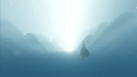
Level 7, Death and Rebirth:
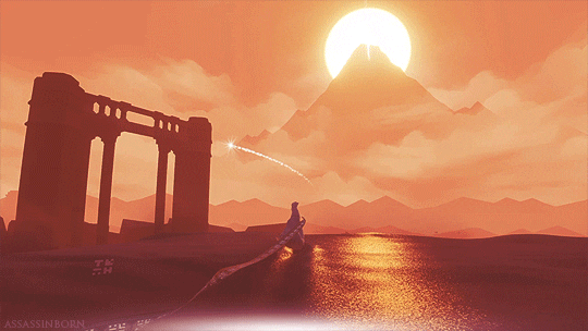
Once the user has made their way around the mountain they come to a very icy windy peak where they can almost see the top of the mountain. The beginning of this level is fast and harsh until slowly they begin to freeze, time almost stands still and eventually they die.
However, the gamer is revived by the white-robed ancestors and your character skyrockets to the top of the mountain, soaring through “heaven” to the white light until finally, they reach the top of the mountain, everything becomes still and the music plays softly until your character disappears into the light.
Ending Sequence:
As the credits play the gamer realizes that they were the shooting star that the traveler saw at the beginning of the game. It ends where they started so they can begin a new journey.
Pacing a game is very important because if it’s too slow then the user will lose interest, and if it’s too fast it can be overwhelming.
This same principle can be applied to web design. Instead of having levels, we have pages that determine the rhythm of the site.
Homepage:
This is the opening to your world, your home base. This page should be neatly spaced out so that the user can figure out their limits, and what to do. They are learning about your site.
Top Level Nav:
These are the pages that will be visited the most often. Having quick and easy access to this information is imperative to keep your users interested and calm. There is nothing more frustrating than not knowing where you are, or where to go (both digitally and physically.) In order to determine what pages are top level nav worthy it’s important to do customer research. A well-organized nav helps users feel in control of their web surfing destiny.
Sub Level Nav:
These are pages that are still important, but not something that needs to be found immediately. Organizing sub level
Footer:
On a gaming console, you can always press pause, or the start menu to take a break and recenter yourself.
The footer is a websites version of a “start menu.” Usually, the footer will display the sitemap, contact info, and sometimes a form. It’s a place where information is easily accessible and consistently placed.
End Goal:
Depending on your website's purpose the end goal could mean a lot of things. It could be filling out a contact form, subscribing to a service, or making a purchase etc. However, the end goal has to feel exciting. The user has learned about you, your product or service, and now they are willing to open up to your brand. Pacing the user experience to get to this point is very important for quality leads. If they had fun exploring your website and they feel that your brand is trustworthy then they will reward you, and hopefully someday become a loyal customer.
Takeaway:
Web Design is very similar to game design:
You are creating a world for users to explore, and visual cues will help teach the user how to navigate your website.
- Hierarchy: Important to guide the user to your intended goals. This can be achieved through typography or a grid.
- CTA’s: will encourage an action, and keep the user engaged. Make sure that they are consistent so that the user is always confident when using a CTA.
- Animation: can help highlight important information, but can be distracting if it's overused.
- Establish Rules: Have a consistent action color so that if a user feels lost they at least know what the next step should be. Don’t reinvent the wheel, if you have a list set up one way there is no reason to create a whole new user experience on a new page for another list. Teach them how to use it once and let them use that knowledge throughout the rest of the site.
- Storytelling: In order to keep a user
active , they must feel compelled to keep exploring; you can tell your story through visuals and copy. - Pacing: Have you ever landed on a website and felt overloaded by how much clutter is on a page? If a user has no idea where to go or what is important they will get frustrated and leave your site. Pacing out information through negative space and top and sub level
navs will ease the journey for your user.
The thought process behind creating a website and creating a game really isn’t that far off. A user is given a tool (controller, mouse, keyboard) and they are dropped into a world that they don’t know (game world, website) and the user has to figure out the end goal of being in that world.
Games use gameplay to create interactions that help push the user forward while websites use micro-interactions, hierarchy, and calls to actions to communicate with the user on what to do next. Each has to teach the user what they are capable of and create an intuitive experience that compels them to keep exploring and eventually reach the end goal and become a loyal customer.
When the elements of great design, user experience, and user interface align, award-winning results can happen.