
As a society, we are rapidly evolving every day, especially when it comes to technology. Brands are constantly rethinking how to reach new customers and how to keep loyal ones.
A website redesign is a great way to give your company a new look without having to rebrand yourself. However, website redesign isn’t just about what’s on the surface; it’s also about improving SEO, conversion rates, & narrowing down your traffic to ideal customers.
Redesigning your website isn't just about what's on the surface; it involves SEO, CRO, and narrowing your traffic down to ideal customers.
Website redesigns can also have an impact on user interface and user experience, or usability in general. With so many people having access to screens, it’s important to keep their experience in mind. The placement of your call to action buttons, how your menu is set up, the hierarchy of imagery to text...these are all things to consider when doing a website redesign. However, this process can be quite a headache if you don’t know what to look out for.
Here are some common mistakes that many marketers (and business owners) make—and how you can avoid them when updating your own website. If you’d like to learn even more about this topic, you can download our free Website Redesign Checklist e-book, too.
1: Not Testing Your Messaging

When it comes to building a website, it’s all about user responses. It’s always best to try more than one idea before making an executive decision on your brand messaging.
Do your headlines entice users on your site? What type of traffic are you getting? How can you steer ideal clients to your page?
A/B testing allows you to try different voices for your company to see which one speaks to your ideal audience. This is a great way to test your taglines, headlines, copy, and even imagery.
A/B testing needs to be done consistently in order to make sure that you are reaching the right audience. If you went to a grocery store and they always had the same things on sale, it would get boring very quickly. So, changing up your headings and adding new content will keep your site fresh and lead to a better SEO ranking.
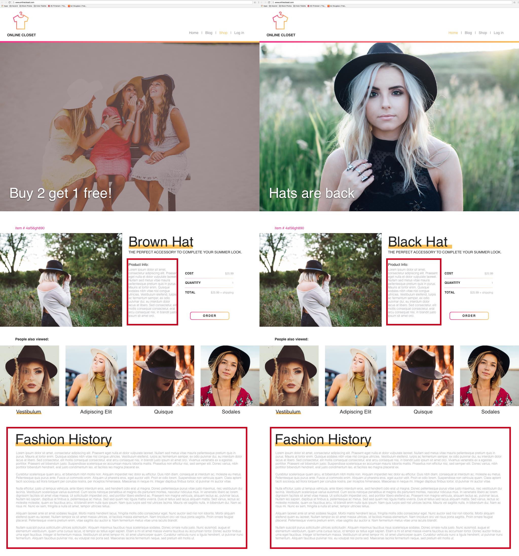
2: Clutter
Imagery can be a very impactful tool to use on your website, but when is it too much? Users today are used to clean, minimalistic design, so it’s best to avoid cluttering your website with images and ads. Negative space can be just as powerful as positive space.
- Negative space: the areas that aren’t filled by content or images.
- Positive space: the areas consumed by content or images.
If your website is filled top to bottom with images and copy, then a visitor will probably feel claustrophobic and overwhelmed; consequently, they will more than likely leave your site due to these feelings.
Hierarchy allows the user to see where their main focus should be while scrolling through a page. It is much better to have a few great areas of imagery rather than cluttering your whole website.
Example:
In the above pictures, the left one is very cluttered. Almost the entire page is filled with content and photos, making it overwhelming for the user to choose an area to focus on. They established a little hierarchy at the top of the page, but that should be more consistently carried throughout.
The right one plays with the image in the layout itself. There is a clear idea of what the user needs to know and where they should be looking. This image allows the user to establish hierarchy and pulls their attention to the important information. There is a great negative-to-positive space ratio in this layout.
3: Duplicate Content
Most users go straight to the web when they want to research a problem that they are trying to solve. Have you ever wondered why some sites rank higher than others when you search on Google? This is due to search engine optimization (SEO), which is important because a well-optimized site ranks higher in the search results for the web.
Duplicate content can be found on more than just your site. This blog has multiple duplicate content checkers you can use. If another blog has similar content to you, it will detract attention from the copy that you have posted. The old term “quality over quantity” is a great phrase to keep in mind when writing content for your site—our one of our top tips for being a better blogger. Instead of having the same information posted on several avenues of your site, it’s better to have one great page, article, or blog with the right keywords to attract your target audience.
For example, if you wanted to talk about branding, pick a few keywords that you want to emphasize in your copy. As you write, pay attention to how often you use those keywords. This is much better than having the same paragraph about branding on different pages in your site. Keywords will benefit your business when people search about “branding.”
It is imperative to avoid duplicate content if you want to have a higher ranking in Google searches. If you have several pages on your site that repeat content, it will confuse Google in deciding which one is more important, thus decreasing your rank. This blog has a great in-depth explanation of ways to improve your website's SEO.
4: Templates
You are a successful, unique business, so why shouldn’t your website be unique too? A recent article that I read from Invision talked about how designs are becoming more minimalistic, creating a very similar feel in different apps. Due to this movement in design, much of the UI design as of late is looking very similar. Most websites feature simple icons, pops of color, big headings, & simple imagery. With this becoming the new UI standard, having a unique layout is what will set you apart from your competition.
That being said, it is important to avoid templates. Templates are like school uniforms: they are made to simplify the process of getting ready, but in the end, everyone looks the same. Using a template limits your ability to stand out as a company, and it diminishes the possibility of having some personality on your site.
A good website redesign will consider the layout, content, and unifying your site through text, color, and imagery, and find a balance of each to create a great UX. It’s best to avoid pre-made templates if you want users to stick around and become brand advocates.
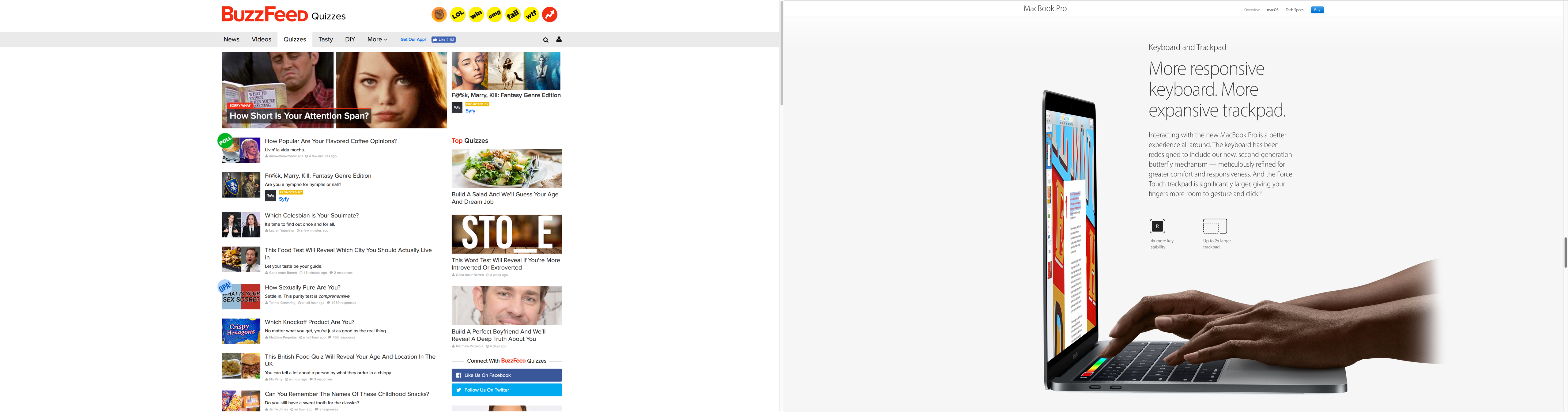
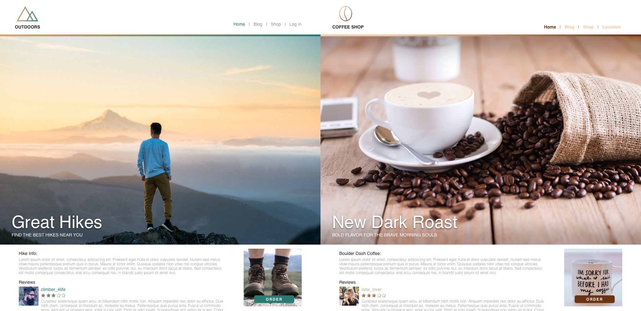
5: Non-Responsive Design
When cellphones first came out, most of them didn’t have access to the internet—imagine that, Gen Z! Today, smartphones are a must for the general public; we use our phones constantly. This is why responsive design is no longer a choice, but a necessity. We are living in a world that has dozens of screen sizes. Between cellphones, tablets, laptops, and monitors, there are so many platforms for your website to be accessed through. If a user has an unpleasant experience with your website on any device, then they are highly unlikely to stay on your site or become a customer.
Responsive design is essential for functionality and keeping your current users happy along with generating new users. It is important for your users to have a pleasant experience no matter what device they use to find your website. For more, here are our top tips on designing with usability in mind.
Responsive design isn’t just about shrinking text and images to fit different screens, either. You still have to maintain logical user interface (UI) and user experience (UX) in your responsive designs. For example, it takes much longer for videos to load on mobile than it would on desktop or laptop, so for mobile, it would be a good idea to use a photo instead of a video in that space.
You can also have a responsive logo to match different screen sizes. A responsive logo takes away more and more elements to simplify an idea while maintaining the same message. Take Walt Disney as an example: below, you can see each version of their logo still has the same qualities, but each progression has fewer bells and whistles than the last. The Disney “D” is just as effective as the entire castle behind “Walt Disney.” Other great examples of responsive logos include Nike and Chanel.

Conclusion
To create an impactful website redesign, keep the following things in mind:
- Test your messaging to see what conveys best to your ideal customer.
- Embrace negative space and use imagery to enhance your site. No one likes clutter.
- Avoid duplicate content to have better SEO results.
- Be unique; avoid templates.
- Responsive design is a MUST.

Want to learn more about redesigning your website? Download the full Website Redesign Checklist ebook.
Not sure if your website is in need of a refresh? Ask yourself these 24 crucial questions to find out.
Have other questions about your website or brand? Give us a call—we're always happy to help!